Comparison
A Comparison widget displays a summary table with the values of the selected data attributes in different groups.
Use the widget to compare multiple values from different categories within a single widget. For example, you can compare the average bill in restaurants from different areas of the city.
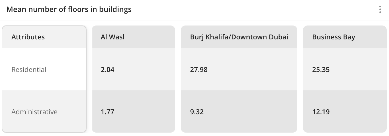
Case example: compare the average number of floors in buildings from different administrative districts:
Main features
-
The values of comparison attributes are grouped in the widget by columns. As groups, you can select:
-
Territories:
-
Standard territories: regions, districts, settlements, and others.
-
Custom territories: first upload your own dataset with polygons and create a territory filter.
-
Territories specified in geofilters for the current dashboard scene.
-
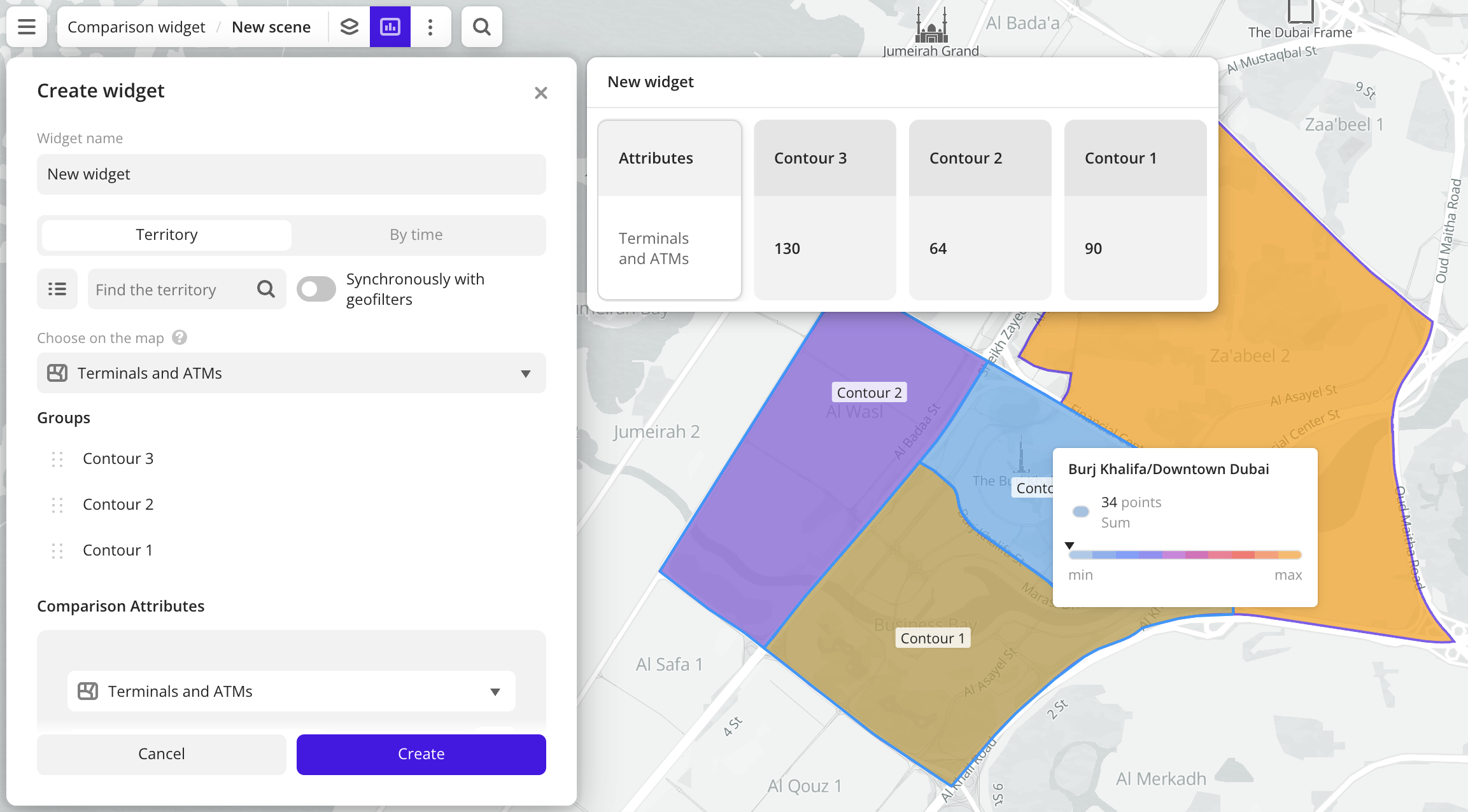
Data visualization elements in layers with H3, Contour, or Polygon methods. To select an element, click on it on the map. Example:
-
-
Time ranges.
-
-
Each column contains the values of the selected comparison attributes (aggregation attributes). The attributes can belong to different data layers. As comparison attributes, you can select:
-
Numeric attributes: to count the number of values in the sample or to count values of the attributes using aggregation functions: total, mean, minimum, maximum value, median, and percentile.
-
Text attributes, logical attributes, or number of objects: to count the number of values in the sample.
You can calculate specific values of the comparison attribute per area unit (in km²) for each group.
-
-
The maximum number of groups (columns) in the widget is 100. The maximum number of comparison attributes is 100.
-
If necessary, you can edit the names of the comparison attributes displayed in the widget. The attribute names in the dataset will not change.
-
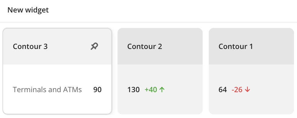
You can display in the widget the attribute values in groups or the difference between them and the values in the target group.
-
Changes in layer data are automatically reflected in the widget.
-
If the filtering by territories or data attributes is applied on a dashboard scene, only the values that match the filters are displayed in the widget. For more information, see the Filtering data on a scene instruction.
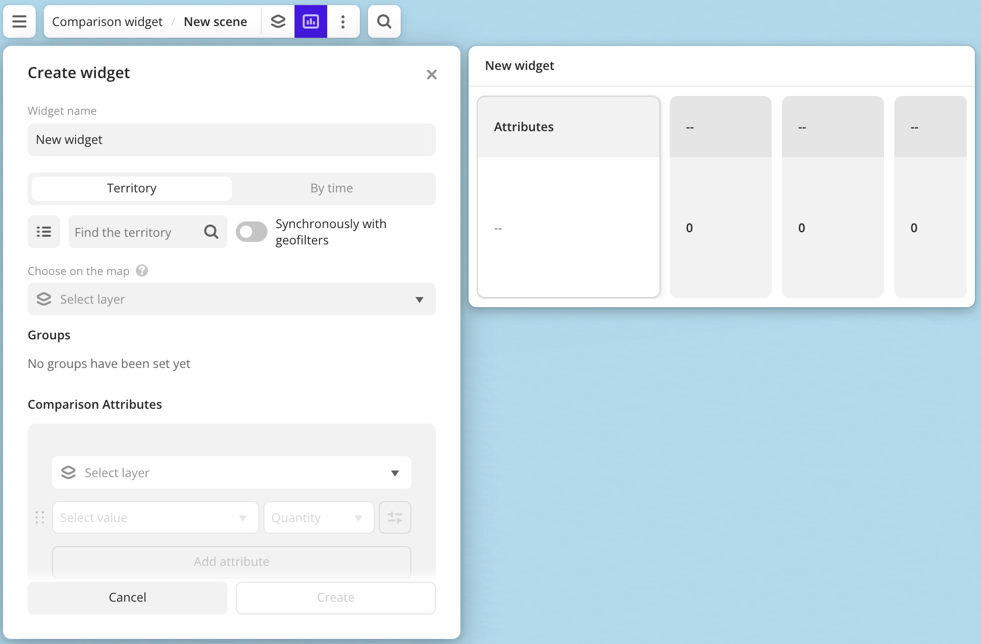
Creating a widget
-
Go to the Dashboards tab.
-
Open the dashboard.
-
Open the scene using the arrows
 and
and  . If the dashboard has only one scene, it will open automatically.
 -
In the top menu of the dashboard, click the
 icon.
icon. -
Select the Comparison widget type.
-
Specify the required parameters:
- Groups: territories or time ranges for which attribute values are calculated.
- Comparison attributes: values displayed in the widget:
- Layer: data layer containing the required attributes. If you work with the uploaded data, make sure it contains at least one attribute.
- Aggregation attribute: attribute used to aggregate data and calculate the values.
- Aggregation type: function used to calculate aggregation attribute values.
-
Set the remaining widget parameters if necessary.
-
Click Create.
The new widget is automatically added to the selected dashboard scene.
Parameters
General widget settings
Parameter | Description |
|---|---|
| Widget name | Widget name. |
Groups
Parameter | Description |
|---|---|
| Territory | Selecting territories as groups for comparison. You can select:
|
| By time | Selecting time ranges as groups for comparison. Available only for layers from datasets containing attributes with the Date type.As values, you can select the following:
|
| Groups | You can perform with groups the following operations:
|
Comparison attributes
Parameter | Description |
|---|---|
| Layer | Data layer containing the required comparison attributes:
To add an additional data layer, click Add layer. You can select one layer multiple times. To change the order of layers and the corresponding attributes in the widget, hold The maximum number of layers is 100. |
| Aggregation attribute | Attribute, which value is aggregated and displayed in the widget:
When the data value changes, the value in the widget is also updated automatically. To add an additional data attribute, click Add attribute. To change the order of attributes (rows) of one layer in the widget, hold The maximum number of attributes for each layer is 100. |
| Aggregation type | Function used to calculate values of the comparison attribute (aggregation attribute) in each group. For numeric attributes:
For text attributes, logical attributes, and number of objects:
|
| Attribute name | To rename a comparison attribute (aggregation attribute) displayed in the widget, click |
| Formatting | Format of the comparison attribute (aggregation attribute) value displayed in the widget. To change the format, click
|
| Per 1 km² | If the Territory grouping is selected, you can display specific values of the comparison attribute (aggregation attribute) per 1 km² for each group. Click Available only for the Sum aggregation type or for point objects with the Quantity aggregation type. |
Target value
You can set the target value to compare the values from other groups to in one of the following ways:
- select the target value from the layer data attributes on the From datasets tab
- enter the constant target value on the Set manually tab
Selecting a target value
Parameter | Description |
|---|---|
| Target group | Group with one or multiple target values. Values in other groups (columns) will be compared with values in this group. |
| Calculation method | Function used to calculate the change in the group values relative to the target value. Click
|
| Display | Settings for displaying calculation results and the color of icons that show changes in values in groups relative to the target. To specify the icon color, click To specify the display method of calculation results, click
Icon display rules:
|
Entering a target value manually
Parameter | Description |
|---|---|
| Target group name | Name of the target group that will be displayed in the widget. |
| Value | Target constant value to compare values in groups. The target value does not change until you specify a new one when editing the widget. |
| Calculation method | Function used to calculate the change in the group values relative to the target value. Click
|
| Display | Settings for displaying calculation results and the color of icons that show changes in values in groups relative to the target. To specify the icon color, click To specify the display method of calculation results, click
Icon display rules:
|
What's next?
- Get to know more about other Widgets types.
- See available Operations with widgets.
- Getting started.
- Get to know how to work with Data and Data visualization.
- Learn more about Layers, Dashboards, and Scenes.
- Learn about ready-made Analytics scenarios.