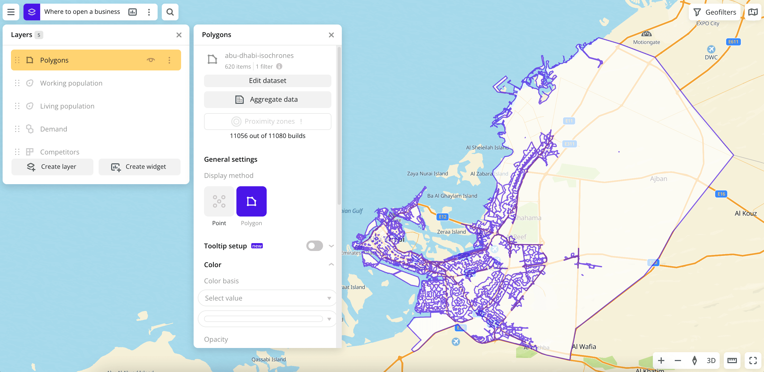
Polygon
The Polygon visualization method is useful for analyzing area objects.
The method supports a 3D format for displaying data on the map as columns.
Overview
To select a visualization method:
- Go to the Dashboards tab and open the dashboard.
- Open a scene using the arrows
 and
and  . If there is only one scene in the dashboard, it opens automatically.
 - To open the layer, click
 icon and select the required layer.
 - In the General settings block, select the Polygon visualization method.
- Set the remaining visualization parameters if necessary.
The data is visualized on the map.
Parameters
Tooltip setup
Parameter | Description |
|---|---|
| Tooltip setup | Enable the option to customize the list of attributes that are displayed in the tooltip when hovering over the polygon on the map. Select the required attributes and change their order if necessary: for more details, see the Configuring a tooltip section. If the option is disabled, the tooltip shows all attributes from the dataset. |
Color
You can set the color of polygons on the map in one of the following ways:
- Based on a data attribute: the color of each element depends on the attribute values.
- Specify a single color for all elements.
Based on a data attribute:
Parameter | Description |
|---|---|
| Color basis | Numeric attribute that determines the fill color of polygons on the map and in the legend according to the color palette. Available values depend on the data in the sample. To reset the parameter, click |
| Type of scale | Distribution type used to calculate data ranges in the legend:
|
| Number of ranges | Number of data ranges in the legend and colors in the palette from 1 to 10. Ranges are calculated automatically based on the Type of scale (for Logarithmic, Linear, and Exponential types). To customize ranges manually, enter the required limits or change the order and number of ranges (Adjustable type). In all ranges except the last one, the specified upper (right) limit is not included in the range.To change the order of ranges, hold down |
| Palette | Color palette (a set of prepared color samples). To change the color for a range, click the color in the legend and select a new one from the palette or specify it in the HEX format. To reset the color, hover over it and click 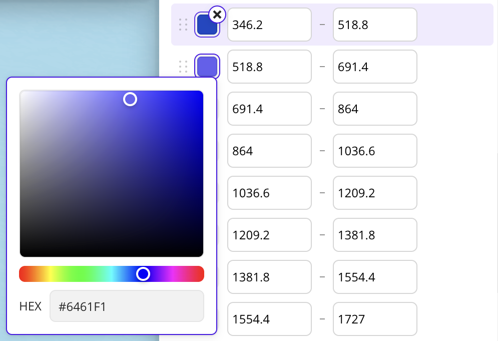 |
| Invert | Enable the option to invert the color palette. All colors in the palette are inverted, except those set manually. |
| Opacity | Opacity of polygons fill in percent. |
Specifying a single color:
Parameter | Description |
|---|---|
| Color | Fill color of polygons on the map and in the legend. Reset the Color basis parameter, select a color from the palette or specify it in the HEX format. Polygons on the map will be colored the same. |
| Opacity | Opacity of polygons fill in percent. |
Outline
Parameter | Description |
|---|---|
| Outline | Enable the option to display the polygon outline. |
| Outline color | Outline color. Select a color from the palette or specify it in the HEX format. |
| Stroke width | Stroke width in pixels from 1 to 25. If the Height option is enabled, the setting is not available. |
| Stroke opacity | Stroke opacity in percent. |
Height
Parameter | Description |
|---|---|
| Height | Enable the option to display the data as 3D columns on the map. To enable 3D display format, select the 3D mode in the bottom-right corner of the map. 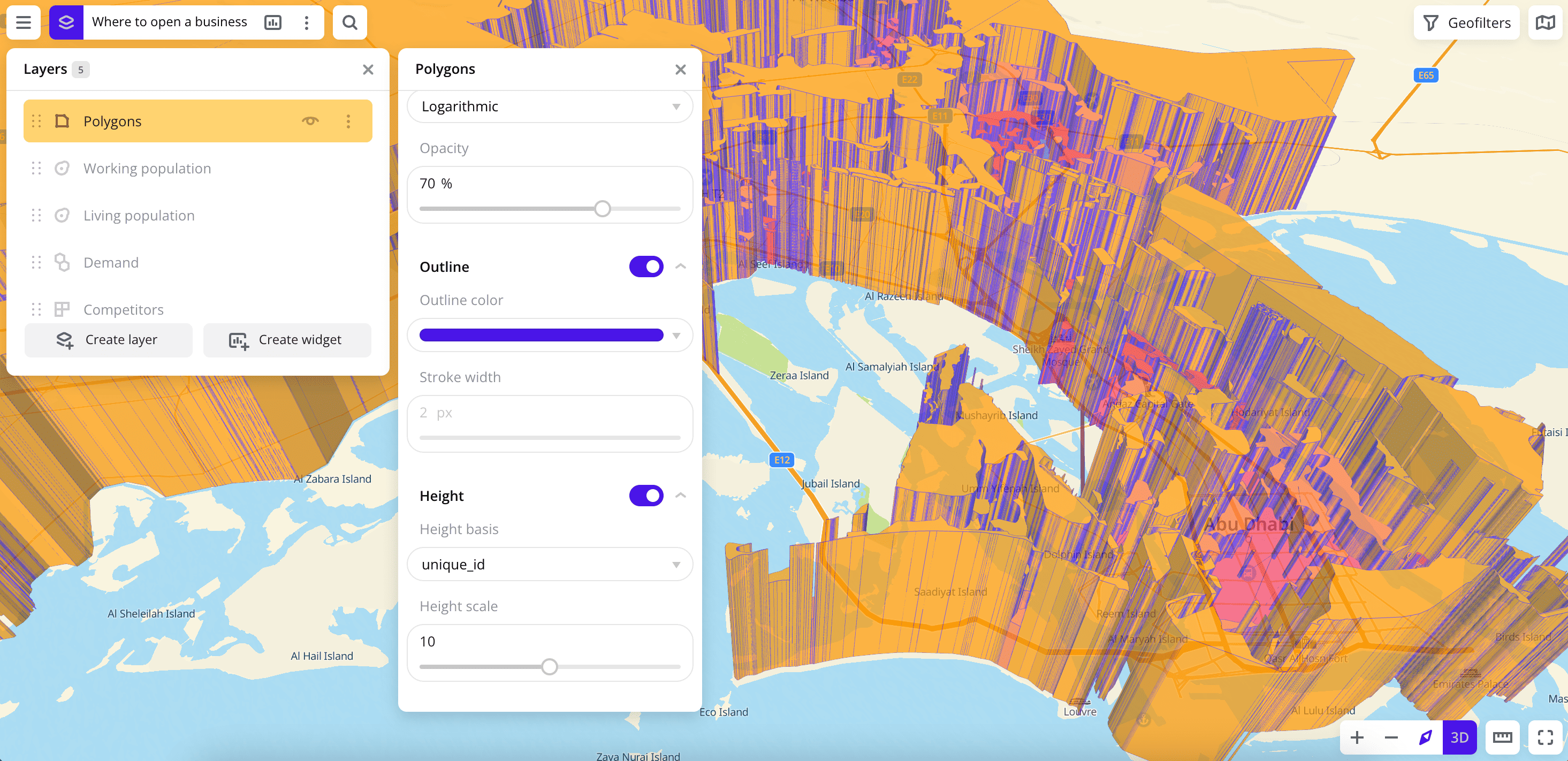 |
| Height basis | Numeric attribute based on which the data is grouped into columns. Available values depend on the data in the sample. |
| Height scale | Column height multiplier from 0.1 to 20. |
What's next?
- Getting started.
- Get to know how to work with Data.
- Get to know how to Aggregate data.
- Learn more about Layers, Dashboards, Scenes, and Widgets.
- Get to know more about other Data visualization methods.
- Learn about ready-made Analytics scenarios.