Location analytics for small and medium-sized businesses
The documentation provides a description with examples of the interface in Russian.
You can analyze a location for your business using an interactive dashboard by purchasing access on a separate page.
The Location analytics interactive dashboard allows you to analyze the potential of locations for small and medium-sized businesses without registering with the 2GIS Pro service. The dashboard helps to find a location for opening a business or a new branch in the food service industry for the selected territory, as well as analyze competitors, evaluate traffic, and access the target audience.
Example of a ready-made dashboard:
Usage scenarios
The dashboard is suitable for owners and managers of cafés, restaurants, bars, coffee shops, and other food service venues. It helps to solve the problems:
- Competitive environment analysis. Count how many similar venues are located in the selected territory and what their specialization is.
- Location potential. Determine the population density and purchasing power.
- Traffic. Evaluate the flow of pedestrians and vehicles near a potential location.
- Demographics and audience interests. Identify potential customers in the selected territory.
Data on the dashboard
The dashboard contains several scenes: sets of layers based on built-in data with customized visualization and widgets.
Before purchasing the dashboard, you can test a ready-made demo dashboard. Open the dashboard on the dashboard order page (the demo dashboard link) and switch scenes to see how you can work with the data.
The dashboard you purchase will contain the same components (scenes, layers, widgets) as the demo dashboard, but only for the selected territory and selected food service categories:
-
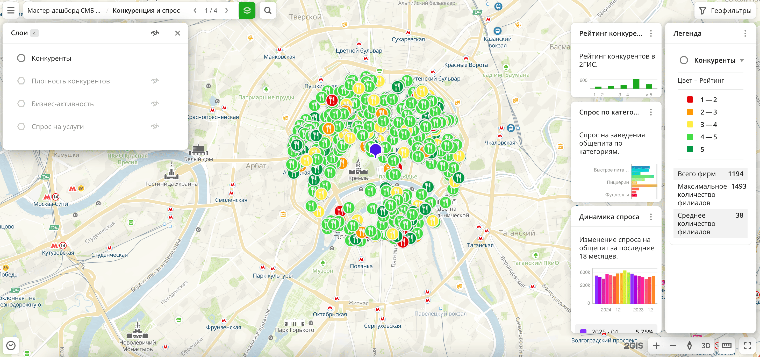
Competitors and demand scene:
-
Competitors layer: sample from the Firms dataset by specified categories. The visualization method is Point.
-
Competitor density layer: sample from the Firms dataset by specified categories. The visualization method is H3.
-
Business activity layer: sample from the Firms dataset by all firms. The visualization method is H3.
-
Demand for services layer: sample from the Demand dataset by specified categories. The visualization method is H3.
-
Competitor rating widget: column chart with the rating of competitors from the 2GIS directory.
-
Demand by categories widget: bar chart with the demand for venues in different food service categories.
-
Demand dynamics widget: column chart with the change in demand for food service venues over the last 18 months.
-
-
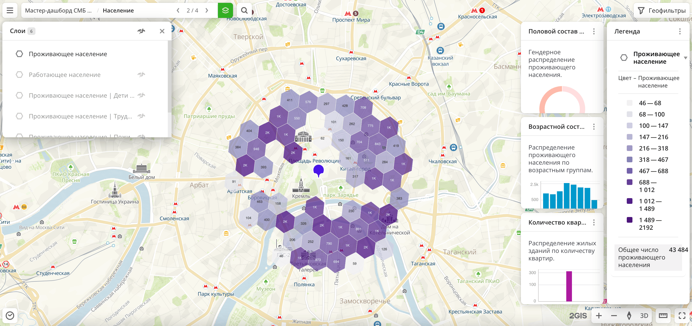
Population scene:
-
Residential population layers: multiple layers with samples from the Age-sex composition of the population dataset with different age categories. The visualization method is H3.
-
Working population layer: sample from the Population dataset with the total number of working population. The visualization method is H3.
-
Number of apartments in residential buildings layer: sample from the Buildings dataset. The visualization method is Buildings.
-
Sex composition of the population widget: pie chart with the distribution of the population by sex.
-
Age composition of the population widget: column chart with the distribution of the residential population by age groups.
-
Number of apartments widget: histogram with the distribution of residential buildings by the number of apartments.
-
-
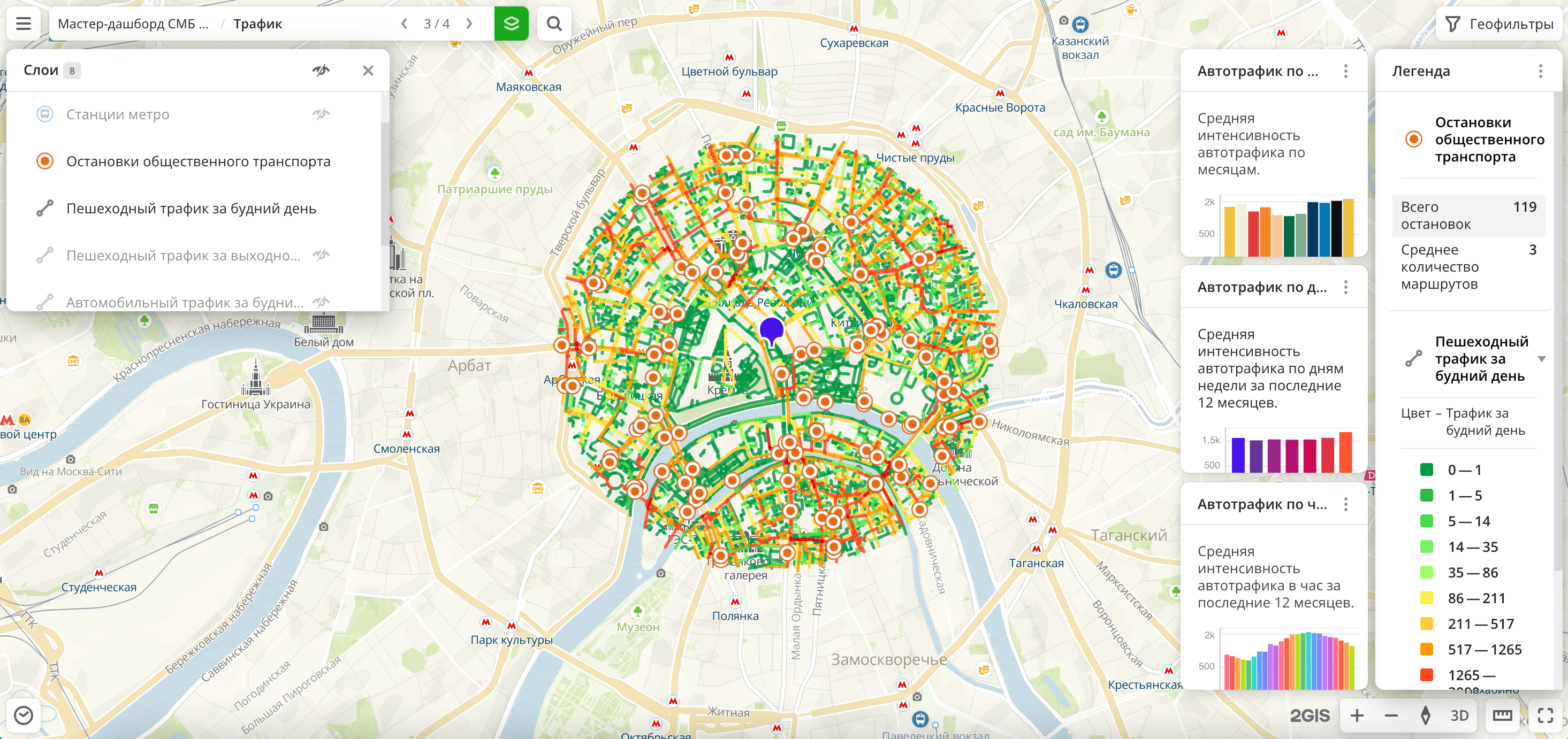
Traffic scene:
-
Metro stations and Public transport stops layers: samples from the Public transport stops dataset. The visualization method is Point.
-
Pedestrian traffic layers: samples from the Pedestrian traffic dataset, filtered by weekdays and weekends. The visualization method is Line.
-
Car traffic layers: samples from the Detailed car traffic dataset, filtered by weekdays and weekends. The visualization method is Line.
-
Car traffic (aggregated) layer: sample from the Car traffic (aggregated) dataset. The visualization method is Line.
-
Car traffic by months widget: column chart with the distribution of average car traffic by months.
-
Car traffic by days of the week widget: column chart with the distribution of average car traffic by days of the week over the last 12 months.
-
Car traffic by hours widget: histogram with the distribution of average hourly car traffic over the last 12 months.
-
-
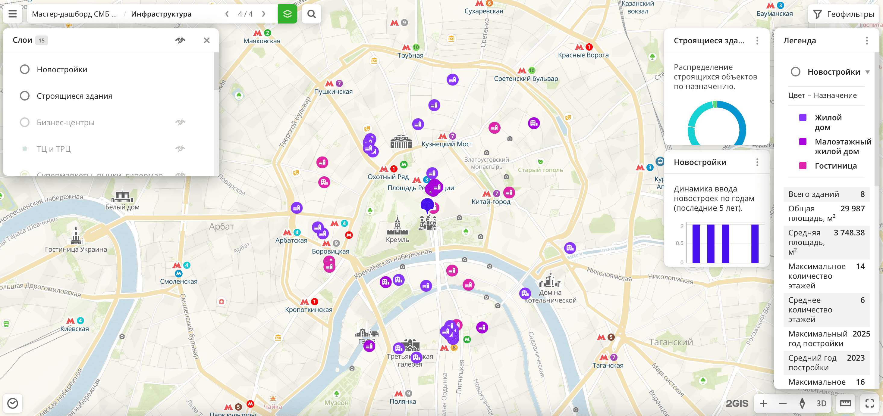
Infrastructure scene:
-
New buildings layer: sample from the Buildings dataset. The visualization method is Point.
-
Buildings under construction layer: sample from the Buildings dataset. The visualization method is Point.
-
Business centers, Shopping centers and malls, Supermarkets, Schools, Beauty and health, and many others layers: samples from the Firms dataset. The visualization method is Point.
-
Buildings under construction widget: pie chart with the distribution of buildings under construction by purpose.
-
New buildings widget: column chart with the distribution of new buildings by year.
-
You can view and switch dashboard scenes, show and hide layers, move widgets on the scene, and filter data through widgets.
Getting access
To get access to the dashboard:
- Go to the dashboard order page.
- Specify the city or district for which the dashboard will be built.
- Select up to 20 food service categories.
- Enter your email address.
- Click Buy and pay for the dashboard by bank card.
A unique link to the interactive dashboard will be sent to the specified email address. The dashboard is available for 7 days.
What's next?
- Get to know service features description.
- Getting started.
- Learn about ready-made Analytics scenarios.
- Get to know how to work with Data and Data visualization.
- Learn more about Layers, Dashboards, Scenes, and Widgets.