UI controls
Map
All SDK distributions contain a standard set of UI controls for operating the map. You can add it to your layout and use it to manage map parameters.
All UI controls listed below must be added as child Views in relation to the MapView. The process of creating and adding MapView is described in the Creating a map section.
The standard set contains the following controls:
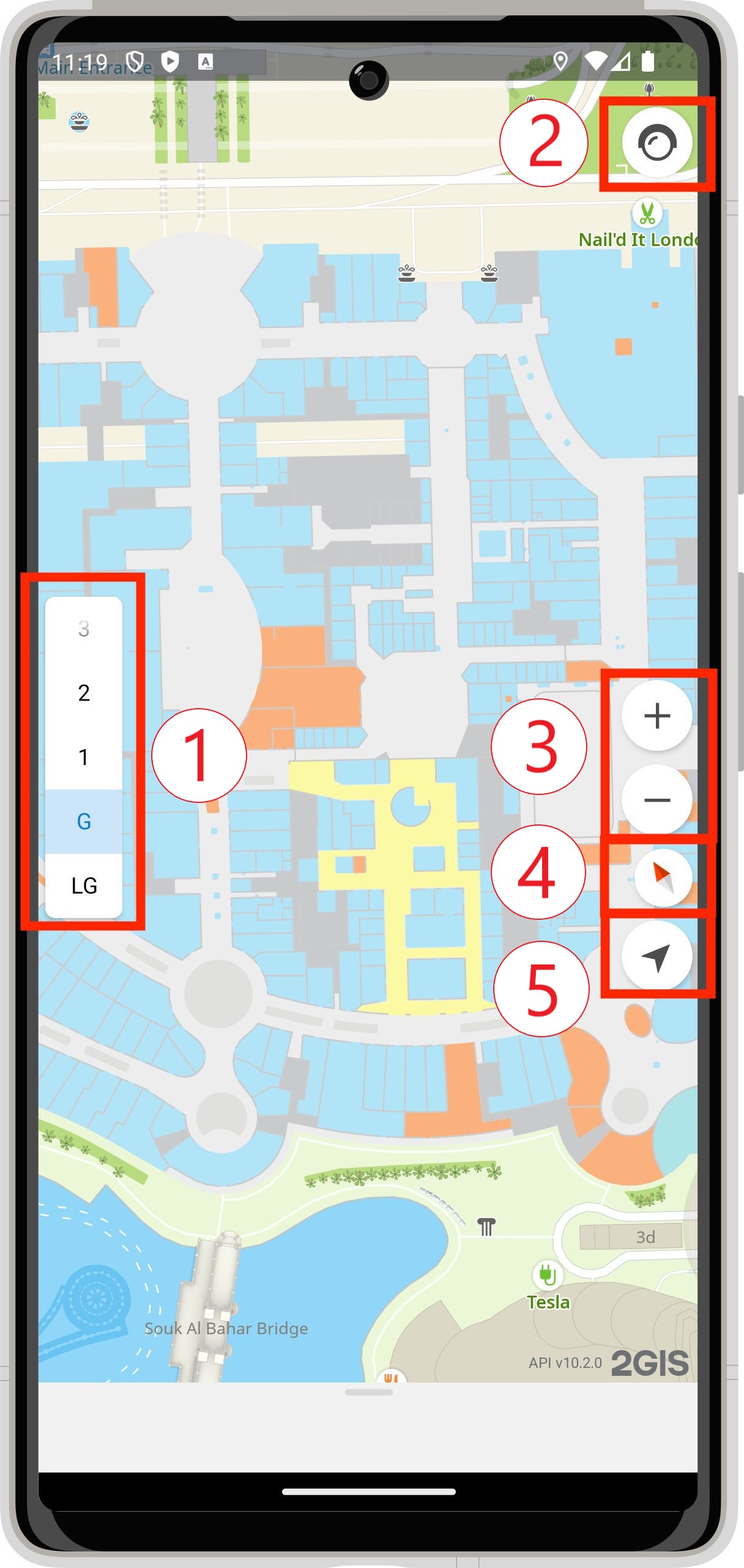

- IndoorControl to switch floors.
- TrafficControl to manage the visibility of traffic jams on the map.
- ZoomControl to change the scale.
- CompassControl to manage the compass.
- MyLocationControl to fly to the current user location.
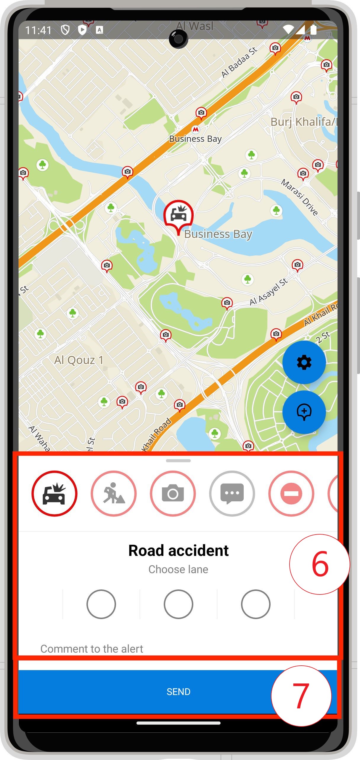
- AddRoadEventCard to describe a new road event.
- AddRoadEventButton to add a road event.
- RoadEventCard to display the road event information.
Navigator
The full SDK distribution contains a set of UI controls for displaying and managing navigation. For convenience, all elements are united into DefaultNavigationControls. The way of using and adding them is described in the Navigation section.
The navigation set contains the following controls:

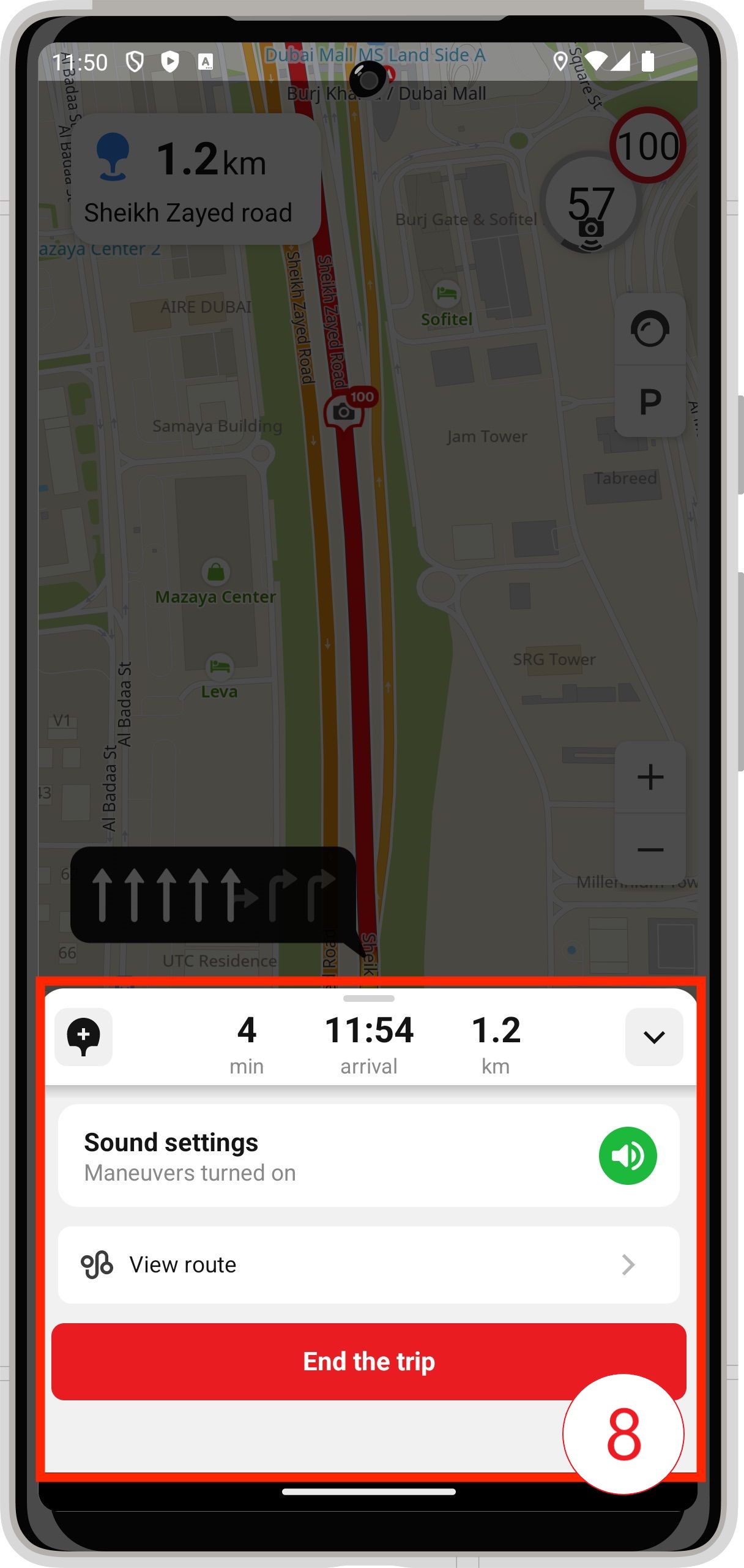
- TrafficLineControl to display the traffic jam level on route.
- ManeuverControl to display information about the next maneuver.
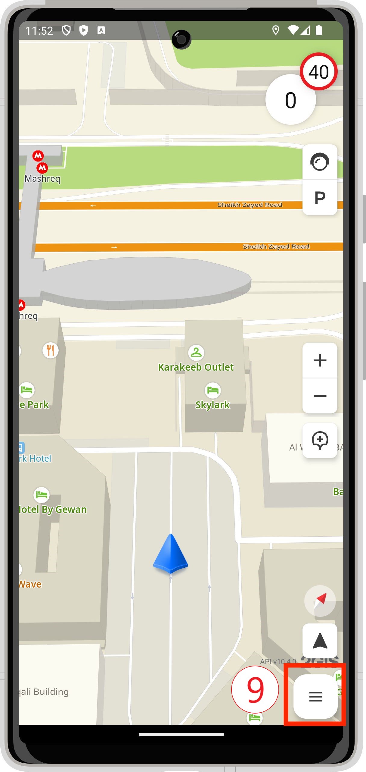
- SpeedInfoControl to display the current speed and the speed limit.
- TrafficAndParkingControl to manage the visibility of traffic jams and parking lots on the map.
- ZoomControl to change the scale.
- CompassControl to manage the compass.
- FollowControl
- DashboardControl to display information in the turn-by-turn mode.
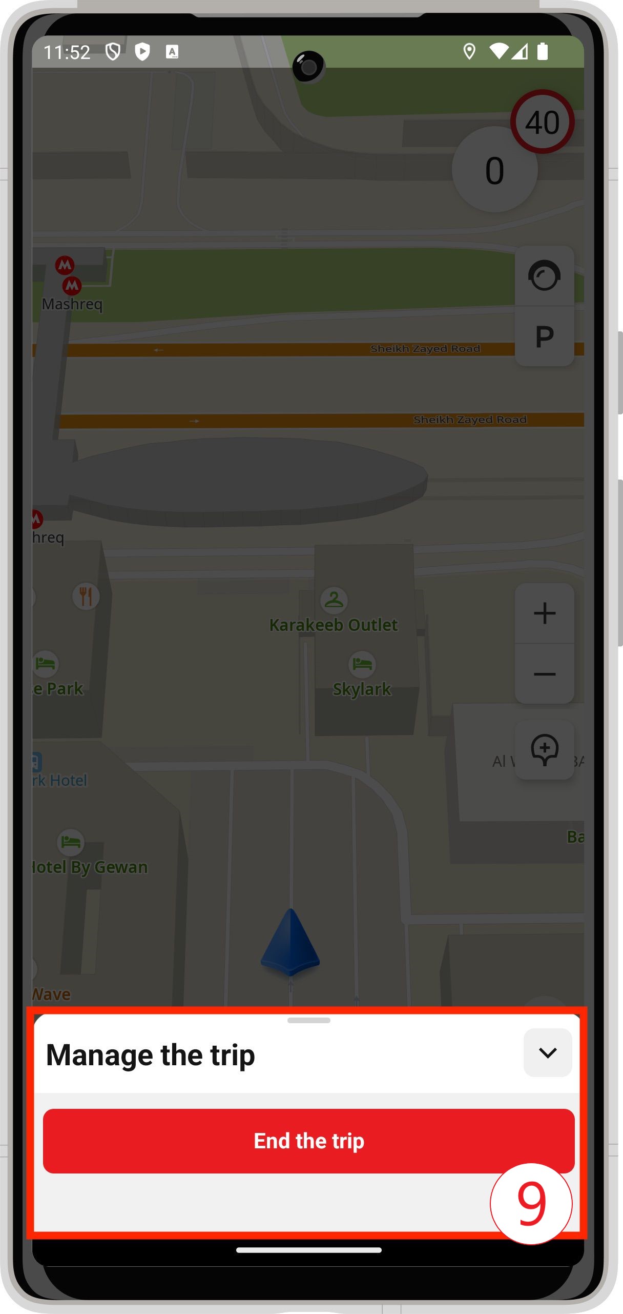

- DashboardControl to display information in the free-drive mode.
- DashboardControl to display information in the indoor navigation mode.
- MarkedByRouteIndoorControl to highlight floors that are passed on route.
Directory
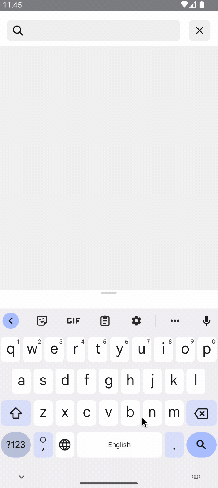
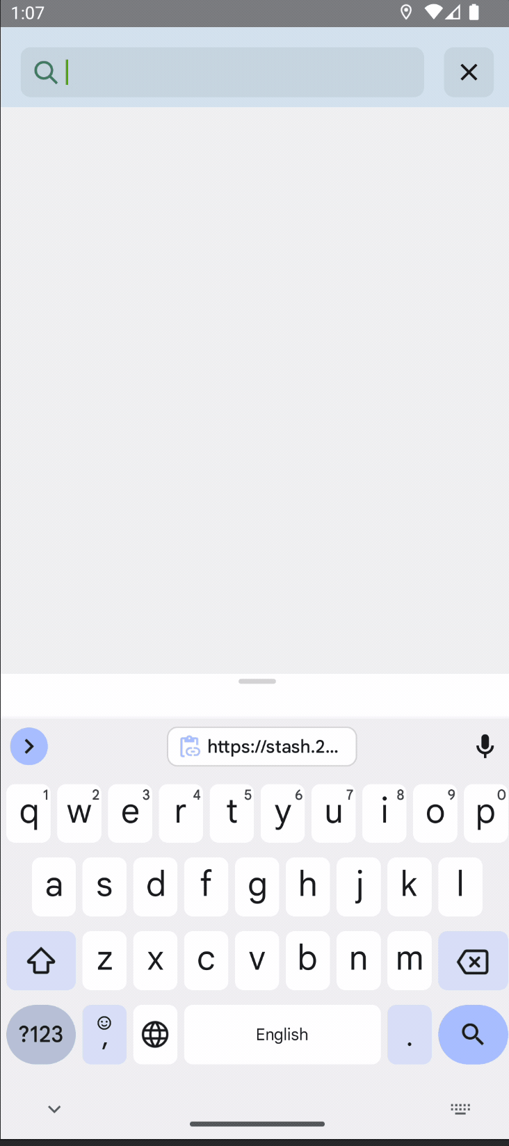
SearchLayout is a component that provides an interactive search bar and a list of results. It is part of both full and map versions of the SDK.
Integration
Adding SearchLayout to the layout is the same as adding any other Android UI control:
<ru.dgis.sdk.directory.SearchLayout
    android:id="@+id/search_view"
    android:layout_width="match_parent"
    android:layout_height="wrap_content"
    app:dgis_pageSize="10"
    app:dgis_searchType="online"
    app:dgis_sortingType="relevance"
    app:dgis_suggestorType="general" />
The dgis_* attributes are for initial setup, see the documentation for SearchOptions for details.
You can also create SearchLayout from code:
// For the example, let's create options and change the SearchType.
// Let's leave the rest of the parameters as default.
val options = SearchOptions(searchType = SearchType.Online)
val searchLayout = SearchLayout(this, options)
You can set up SearchLayout during its creation or configure the parameters during the lifecycle. This is described in the next subsection.
Configuration
When SearchLayout is created, the [configureSearchEngine()](/en/android/sdk/reference/10.0/ru.dgis.sdk.directory. SearchLayout#nav-lvl1--configureSearchEngine) methods of the SearchViewConfigurator interface become available. The methods allow both changing the initial creation settings (search type, output size, etc.) and configuring other parameters such as geoposition provider, object type restrictions, and others.
val locationProvider: LocationService
val searchLayout = findViewById<SearchLayout>(R.id.search_layout)

searchLayout.configureSearchEngine { // this: SearchViewConfigurator
    // Let's add LocationService to get the distance to the object, relative to the current geoposition.
    setLocationProvider(LocationService)

    // Let's change the maximum number of objects in the issue.
    setPageSize(10)
}
Getting results
The addSearchViewCallback method allows you to add an instance of SearchViewCallback. Interface methods allow you to react to events occurring in SearchLayout such as clearing the search box, completing search, and others.
searchLayout.addSearchViewCallback(object : SearchViewCallback {
    // Called when the search bar is cleared.
    override fun searchAborted() {
        ...
    }
    // Called when the user selects an item in the issue, which is a DirectoryObject.
    override fun directoryObjectChosen(obj: DirectoryObject) {
        ...
    }

    // Called when the search has been successfully completed and the result is the following DirectoryObject list.
    // The list can be empty.
    override fun searchCompletedSuccessfully(items: List<DirectoryObject>) {
        ...
    }
    // Called when a search exception occurs.
    override fun searchCompletedWithException(message: String) {
       ...
    }

    // Called when you click on the button to close the search. SearchLayout will be removed from the hierarchy
    // regardless of whether the method is implemented.
    override fun searchClosed() {
        ...
    }
})
You can implement all or only the required methods.
Theme
You can change the color scheme and some other parameters of SearchLayout by changing the theme attributes.
To change the style of the component, set the dgis_searchTheme attribute, which points to the style in your application theme.
<resources>
    <style name="AppTheme" ...>
        ...
        <item name="dgis_searchTheme">@style/customSearchTheme</item>
        ...
    </style>
</resources>
Available attributes:
| Имя аттрибута | Описание |
|---|---|
dgis_searchPrimaryBackgroundColor |
Main background color |
dgis_searchSecondaryBackgroundColor |
Additional background color |
dgis_searchIconTint |
Magnifier icon color |
dgis_searchInputActiveTextColor |
Text color |
dgis_searchInputTextSize |
Search box text size |
dgis_searchResultTitleTextSize |
Text size in the search result heading |
dgis_searchResultAddressTextSize |
Text size in the search result subheading |
dgis_searchResultDistanceTextSize |
Text size in object distance |