Getting started
This instruction will help you to get started with the 2GIS Pro service and get to know its features.
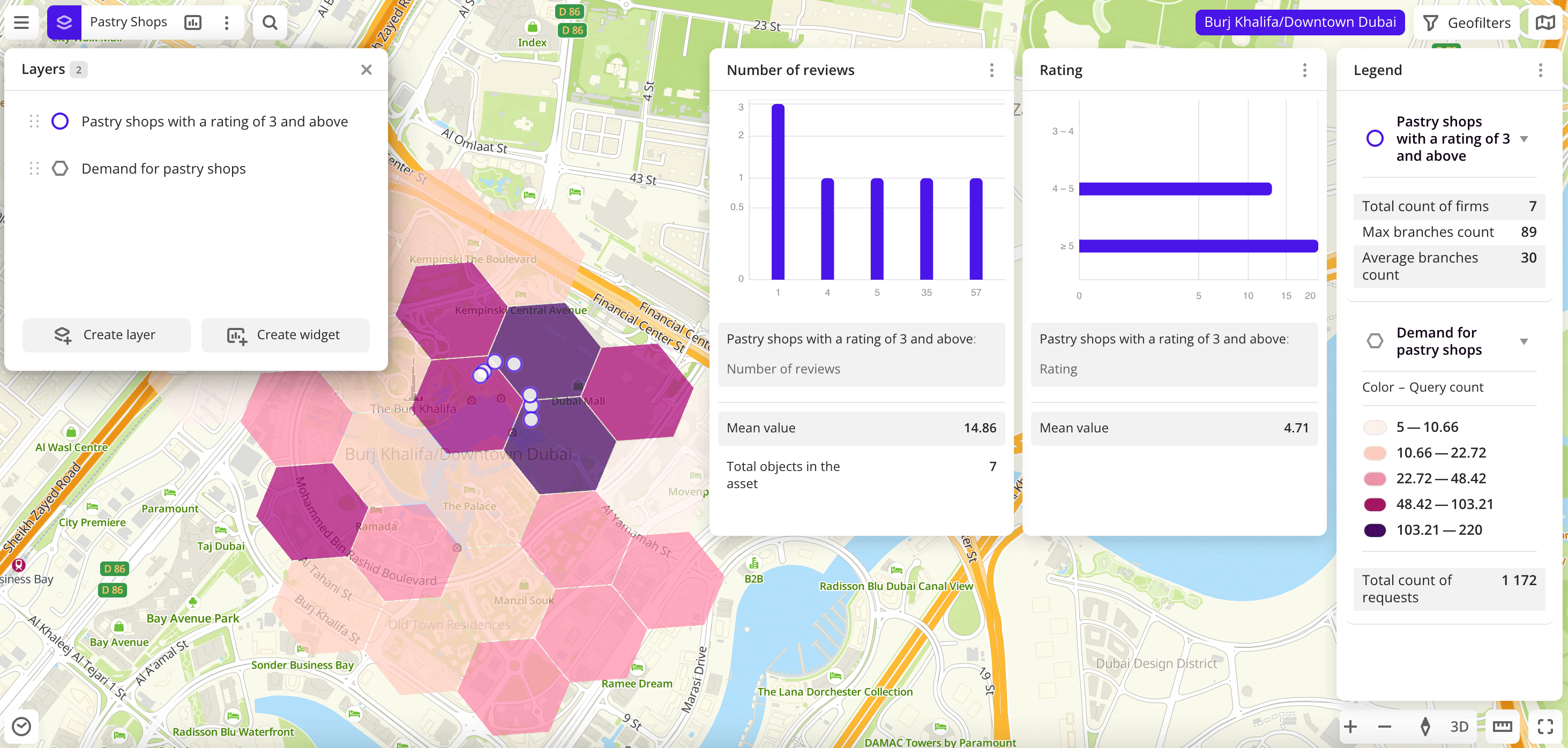
After completing all the steps, you will create a dashboard to analyze demand for pastry shops. The dashboard will contain a scene with the following:
- two layers with data samples and different visualization methods
- a widget with a legend
- a widget with a bar chart that displays the rating of pastry shops from the data sample
- a widget with a histogram that displays the number of reviews in pastry shops from the data sample
For new 2GIS Pro users, a demo dashboard is available on the Dashboards tab. Also, you can analyze the potential of locations for small and medium-sized businesses using the interactive Location analytics dashboard without registering with the 2GIS Pro service.
1. Authenticate in 2GIS Pro
For new 2GIS Pro users, the demo tariff plan is available by default: for details, see the Tariff plans instruction.
In the example, the territory available only in the demo tariff plan is used. If you use another tariff plan and you have not purchased access to this territory, you can complete the instruction steps for any available territory.
2. Create a first data layer and a dashboard with a scene
To create a data layer based on the built-in data and add it to a dashboard scene:
-
Go to the Main tab.
-
Select the Firms dataset.
-
Select the territory for which the data sample is created. To do this, in the Geofilter settings dialog, select
Burj Khalifa/Downtown Dubaiand click Done. -
On the Filters tab, specify the following parameters:
- Click Select categories. Then select Food service → Pastry shops and click Apply.
- In the Rating field, specify the value from
3to5.
-
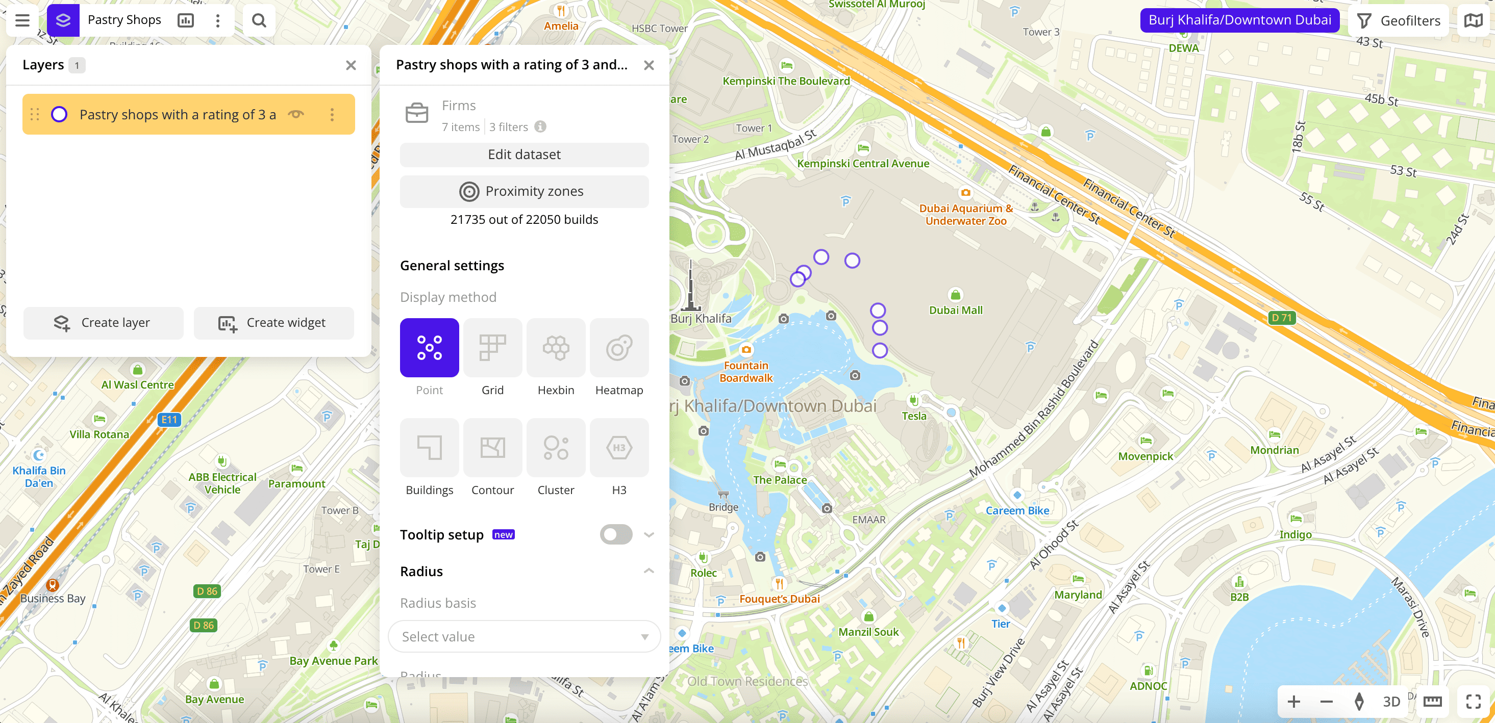
Click Create layer.
A new dashboard with one scene is created, and a new layer is automatically added to it. The layer displays all the pastry shops in Downtown Dubai with a rating of 3 to 5. To rename the layer, double-click on it, enter the name Pastry shops with a rating of 3 and above and press Enter.
3. Create a second data layer
You can add layers to the dashboard scenes and remove layers from scenes.
To create a new layer and add it to the dashboard scene:
- Go to the Dashboards tab.
- Open the created dashboard. The scene opens automatically.
- In the top menu of the dashboard, click
 icon.
icon. - Click Create Layer.
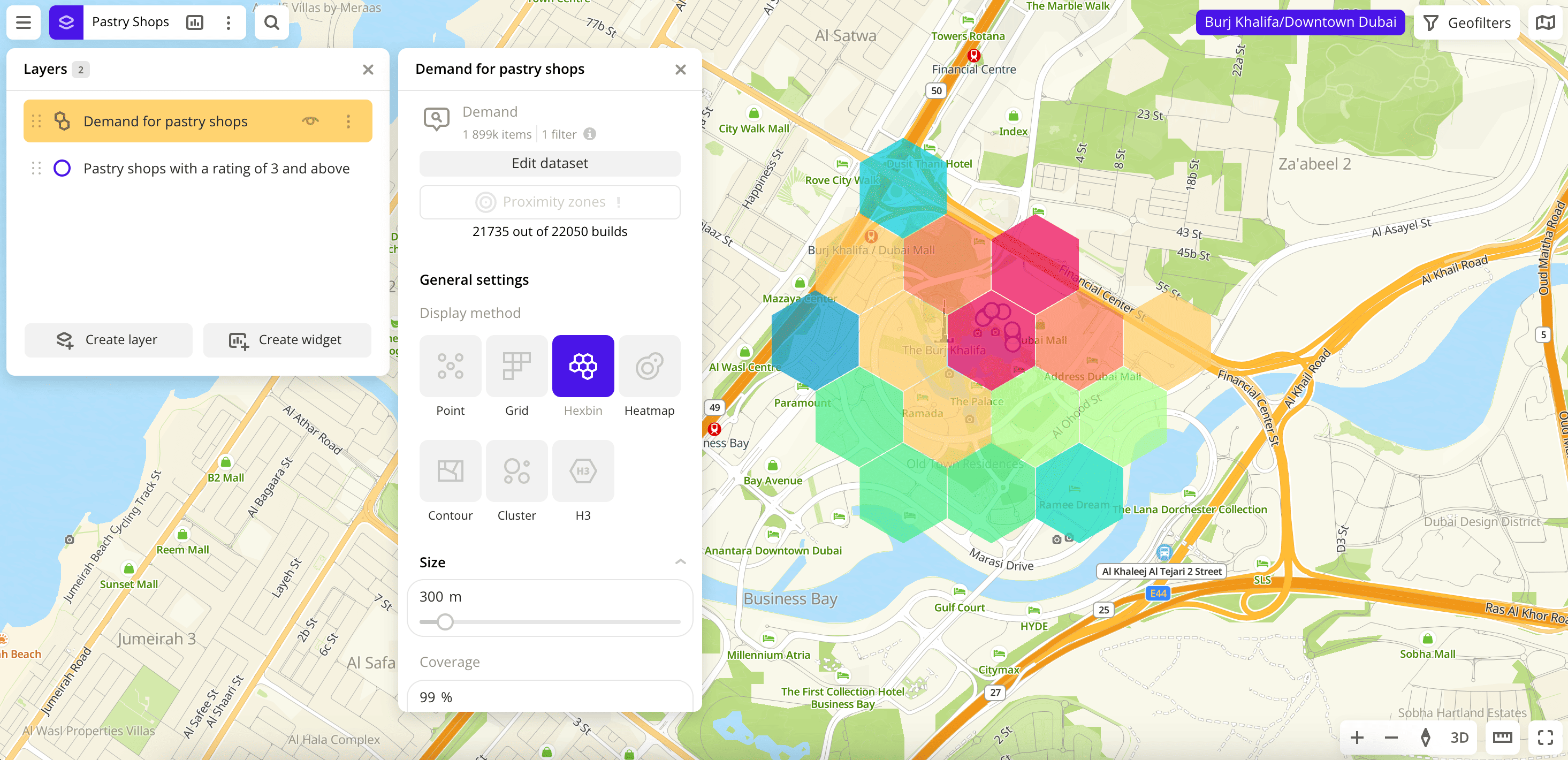
- Select the Demand dataset.
- Select the territory for which the data sample is created. To do this, in the Geofilter settings dialog, select
Burj Khalifa/Downtown Dubaiand click Done. - On the Filters tab, click Select categories. Then select Food service → Pastry shops and click Apply.
- Click Create layer.
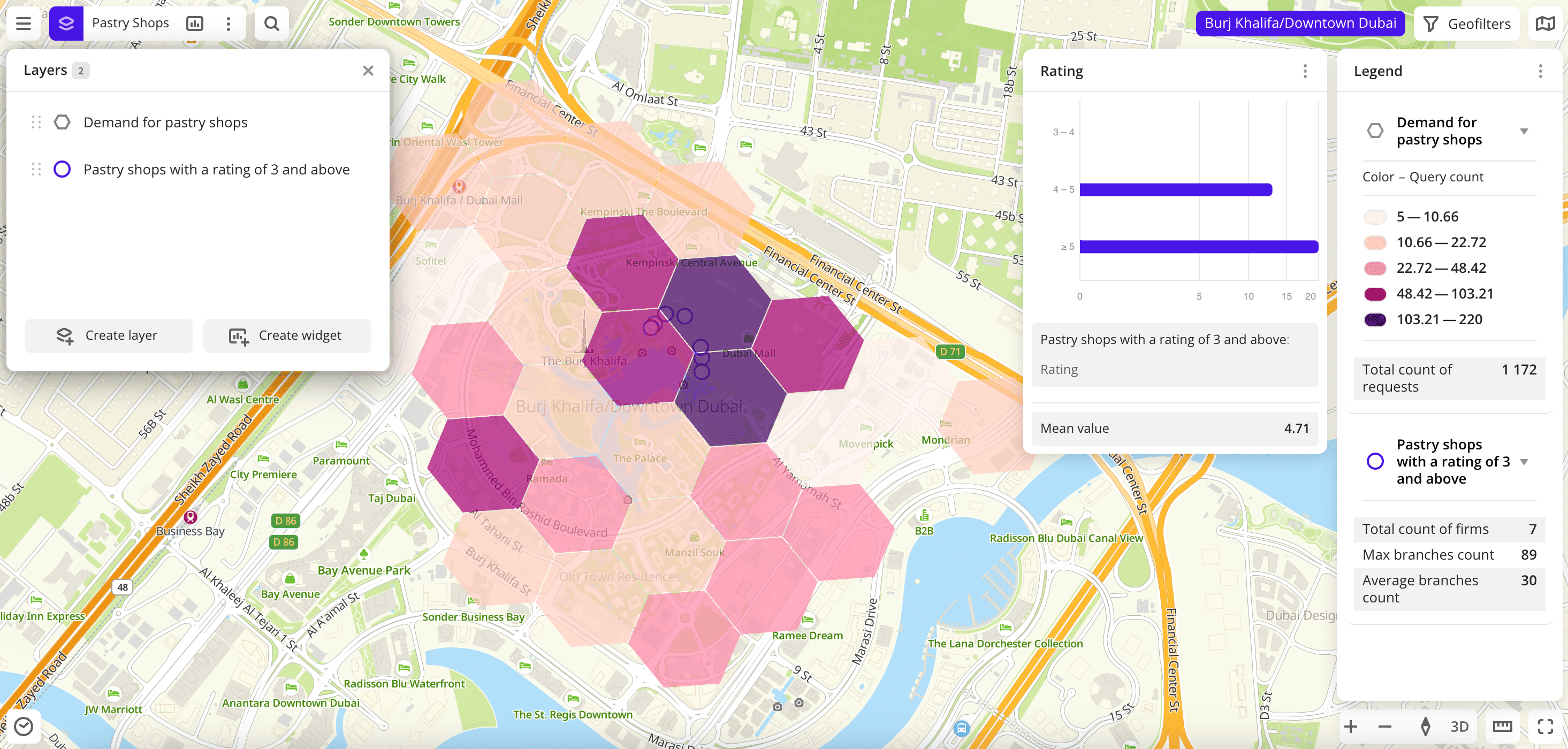
A layer that displays a demand map (number of search queries) for all pastry shops in Downtown Dubai as hexbins is created. The layer is added to the dashboard scene. To rename the layer, double-click it, enter the name Demand for pastry shops, and press Enter.
4. Change the visualization method of the layer
2GIS Pro service allows you to visualize data in different ways, e.g. as a heatmap: see other visualization methods. You can specify visualization parameters for each layer.
To change the visualization method for the Demand for pastry shops layer:
-
In the top menu of the dashboard, click
icon. -
Select the
Demand for pastry shopslayer. -
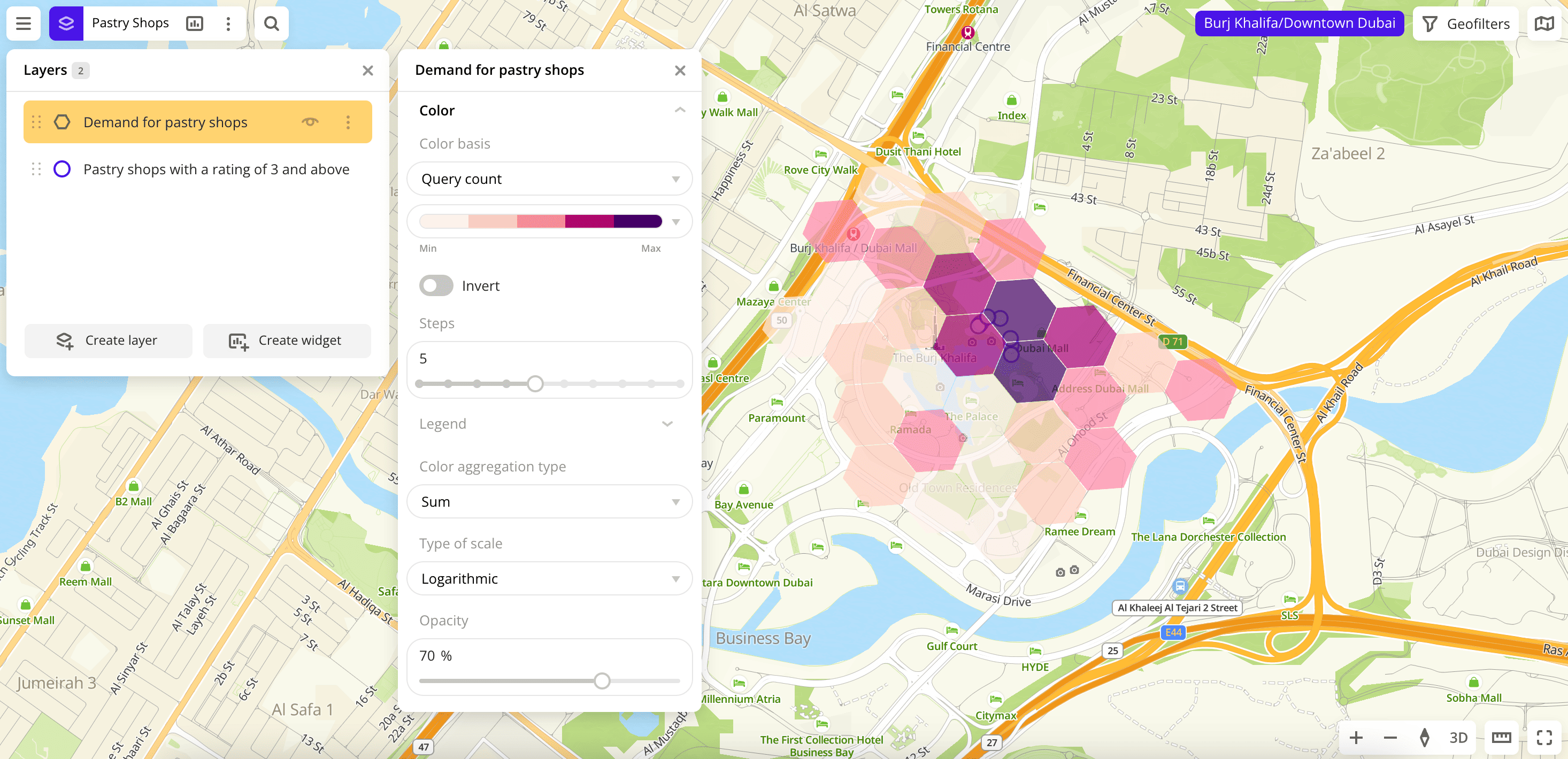
In the General settings block, specify the following parameters:
- Display method: select H3.
- Color basis: select a color palette (a set of prepared color samples) according to which the elements on the map are colored.
- Steps: select the number of colors in the palette, e.g.,
5.
For the Demand for pastry shops layer, the visualization method is changed to H3 (a system with a fixed grid arrangement that does not depend on data). This method is useful in the analysis of spatial data due to the uniform format of the location of cells. The color palette is also changed.
5. Add a widget with a bar chart to the dashboard scene
You can add widgets with different charts based on data to the dashboard scenes.
To add a widget to the dashboard scene:
-
In the top menu of the dashboard, click
 icon.
icon. -
Select the Bar chart widget type.
-
Set the widget parameters:
- Widget name: enter a widget name
Rating. - Layer: select the
Pastry shops with a rating of 3 and abovelayer (with the Firms dataset). - Grouping attribute: select the
Ratingvalue. - Number of ranges: add three data ranges and set the values. To add a range, click
 icon.
icon. - Aggregation attribute: select the
Number of objectsvalue.
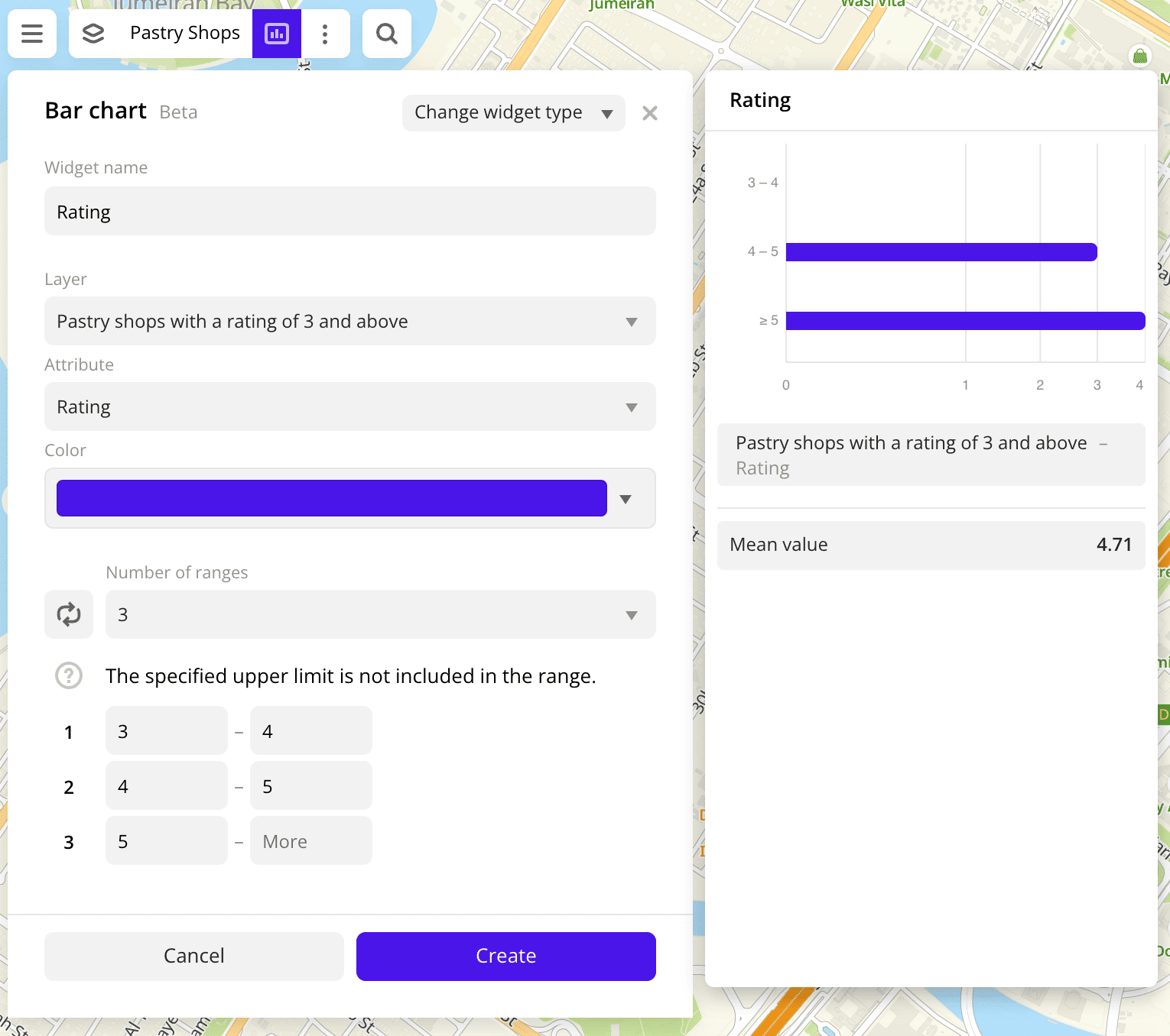
- Widget name: enter a widget name
-
Click Create.
A widget with a bar chart that displays the rating of pastry shops from the data sample and the total number of pastry shops is added to the dashboard scene.
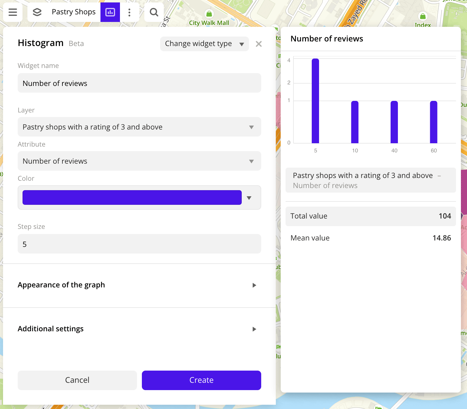
6. Add a widget with a histogram to the dashboard scene
To add a widget to the dashboard scene:
-
In the top menu of the dashboard, click
icon. -
Select the Histogram widget type.
-
Set the widget parameters:
- Widget name: enter a widget name
Number of reviews. - Layer: select the
Pastry shops with a rating of 3 and abovelayer (with the Firms dataset). - Grouping attribute: select the
Number of reviewsvalue. - Step size: enter a size of the data range, e.g.,
1.
- Widget name: enter a widget name
-
Click Create.
A widget with a histogram that displays the number of reviews for pastry shops from the data sample and the total number of pastry shops is added to the dashboard scene.
What's next?
- Get to know service features description.
- Get to know how to work with Data and Data visualization.
- Learn more about Layers, Dashboards, Scenes, and Widgets.
- Learn about ready-made Analytics scenarios.