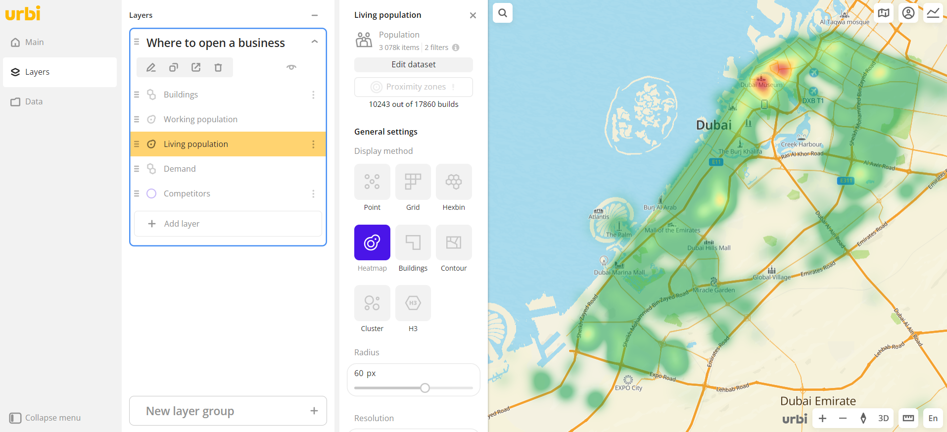
Heatmap
The Heatmap visualization method is useful for estimating the density of data distribution on the map and identifying concentrations of values: large values or, conversely, a lack of data. The visualization adapts to the map scale.
Overview
To select a visualization method:
- Go to the Dashboards tab and open the dashboard.
- Open a scene using the arrows
 and
and  . If there is only one scene in the dashboard, it opens automatically.
 - To open the layer, click
 icon and select the required layer.
 - In the General settings block, select the Heatmap visualization method.
- Set the remaining visualization parameters if necessary.
The data is visualized on the map.
Parameters
Radius
Parameter | Description |
|---|---|
| Radius | Radius of heatmap areas in pixels from 1 to 20. |
Resolution
Parameter | Description |
|---|---|
| Lock level | Click to lock the level of detail. When you zoom in the map, the level of detail is not greater than the specified value. When you zoom out the map, it decreases. |
Color
Parameter | Description |
|---|---|
| Color basis | Numeric attribute that determines the fill color of heatmap areas on the map and in the legend according to the color palette. Available values depend on the data in the sample. |
| Number of ranges | Number of data ranges in the legend and colors in the palette from 1 to 10. |
| Palette | Color palette (a set of prepared color samples). |
| Invert | Enable the option to invert the color palette. |
| Opacity | Opacity of heatmap areas fill in percent. |
What's next?
- Getting started.
- Get to know how to work with Data.
- Learn more about Layers, Dashboards, Scenes, and Widgets.
- Get to know more about other Data visualization methods.
- Learn about ready-made Analytics scenarios.