Overview
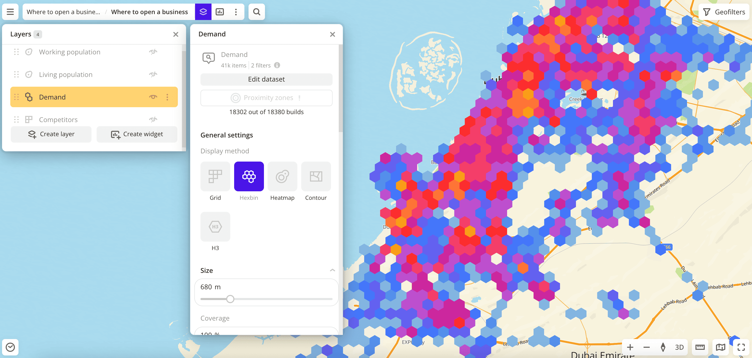
2GIS Pro service provides several data visualization methods:
For each layer, you can customize the visualization in different ways, even if the layers are created from the same data sample. Different settings are available for each visualization method. You can change the layer visualization at any time.
Getting started
- Go to the Dashboards tab and open the dashboard.
- Open a scene using the arrows
 and
and  . If there is only one scene in the dashboard, it opens automatically.
 - To open the layer, click
 icon and select the required layer.
 - In the General settings block, select a visualization method.
- Set the remaining visualization parameters if necessary. See parameter lists in the description of each visualization method, e.g., Point.
The data is visualized on the dashboard scene.
Viewing element information
To view information about a visualization element (point, grid cell, hexbin, etc.) on the map, use the following methods:
-
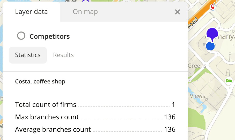
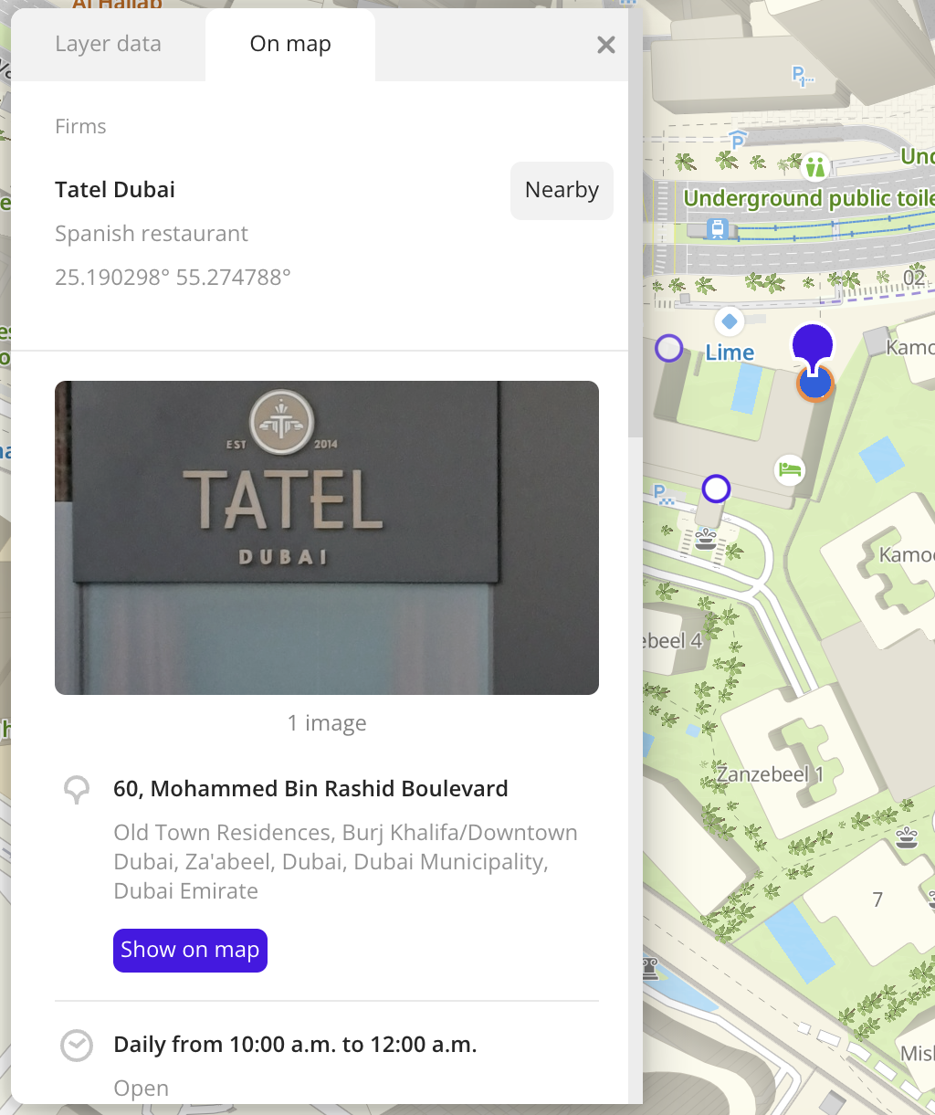
Click the element on the map. The opened pane displays:
-
Layer data tab: information about the layer within the selected visualization element (statistics and result list).
-
On map tab: information about a particular element on the map: organization, building, street, etc.
-
-
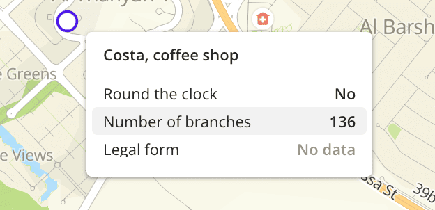
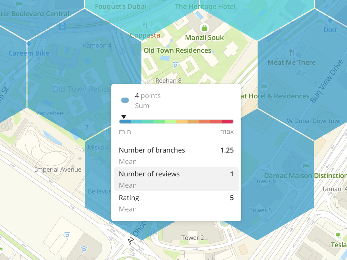
Hover the cursor over the element. A tooltip with a short description of the element appears. The tooltip displays:
-
The list of data attributes and their values.
You can configure the list of attributes, their order, and the aggregation type (only for numeric attributes): see more in the Configuring a tooltip section.
-
The color of the visualization element and the color aggregation type (the function used to aggregate attribute values located in one visualization element).
You can select a data attribute for coloring the element using the Color basis parameter for any visualization method and the color aggregation type using the Color aggregation type parameter (only for Grid, Hexbin, Buildings, Contour, Cluster, and H3 visualization methods).
-
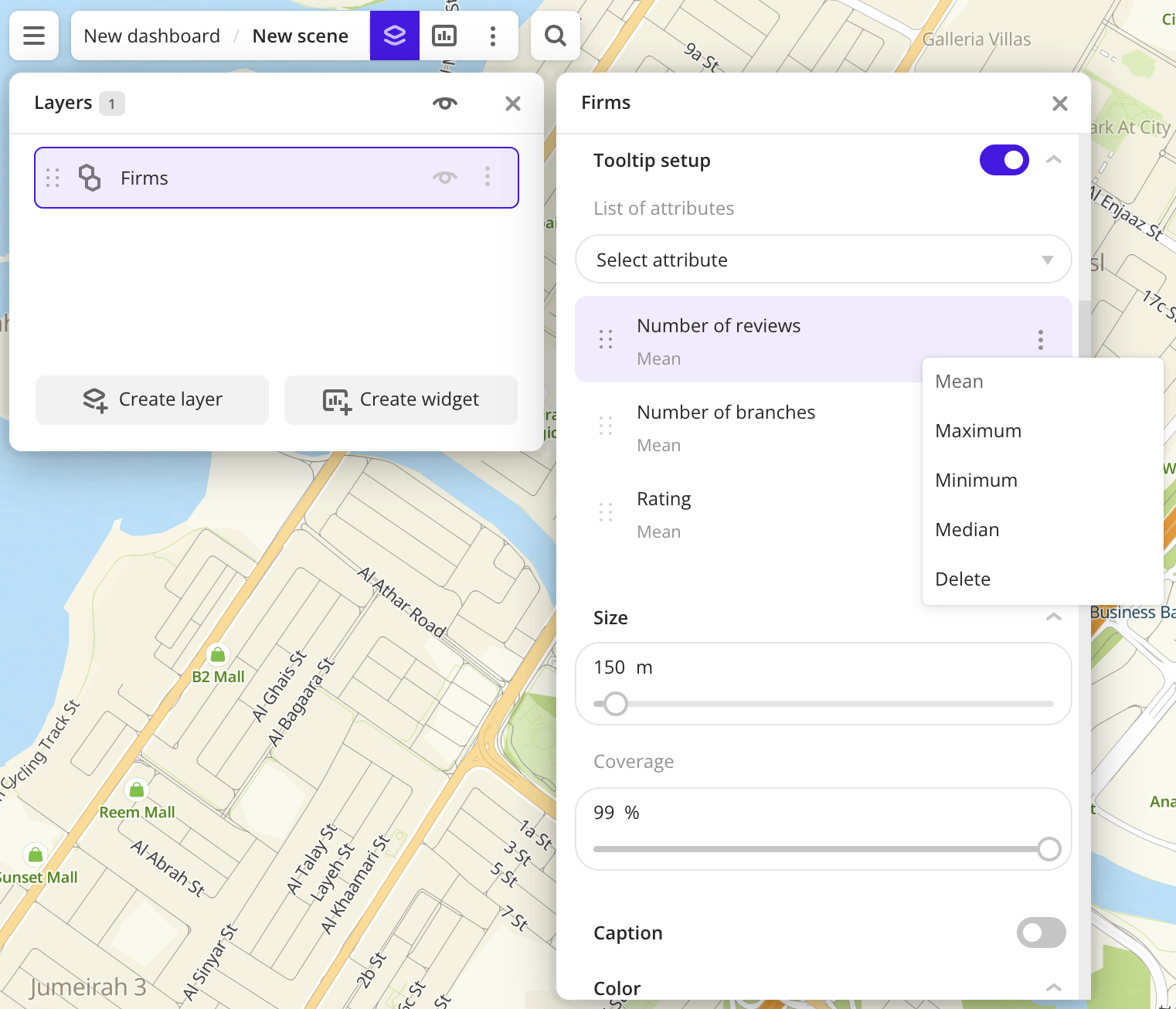
Configuring a tooltip
When configuring the layer visualization, you can customize the tooltip by specifying:
-
The list of data attributes in the tooltip and their order. You can configure the list for one layer or for multiple layers at once (only for datasets uploaded as a file).
Configuring the attribute list is available for layers with Point, Grid, Hexbin, Buildings, Contour, Cluster, H3, Line, and Polygon visualization methods.
-
The attribute aggregation type (only for numeric attributes): the function used to aggregate attribute values located in one visualization element.
Configuring the attribute aggregation type is available for layers with Grid, Hexbin, Buildings, Contour, Cluster, and H3 visualization methods.
For one layer
-
Go to the Dashboards tab and open the dashboard.
-
Open a scene using the arrows
and . If there is only one scene in the dashboard, it opens automatically. -
To open the layer, click the
icon and select the required layer. -
Enable the Tooltip setup option. If the option is disabled, the tooltip displays all attributes from the dataset.
-
Configure the tooltip:
-
Select the attributes to be displayed in the tooltip of the element. Available values depend on the data in the sample.
-
To change the order of attributes in the tooltip, drag the attribute to the required position in the list.
-
To change the attribute aggregation type (only for numeric attributes), click
 icon next to the required attribute and select the aggregation type from the list:
Sum- sum of values.Mean- mean value.Median- median value that is equal to or greater than 50% of values in the group.Minimum- minimum value.Maximum- maximum value.
-
For all layers from one dataset
You can configure the attribute list in the tooltip for all layers created from a dataset uploaded as a file. All layers created from the dataset will use these settings by default.
-
Go to the Data tab.
-
On the required dataset card, click
icon and select Edit. -
Enable the Tooltip setup option. If the option is disabled, the tooltip displays all attributes from the dataset. The attributes are displayed in the order that was specified during upload.
-
Configure the tooltip:
- Select the attributes to be displayed in the tooltip of the element. Available values depend on the data in the sample.
- To change the order of attributes in the tooltip, drag the attribute to the required position in the list.
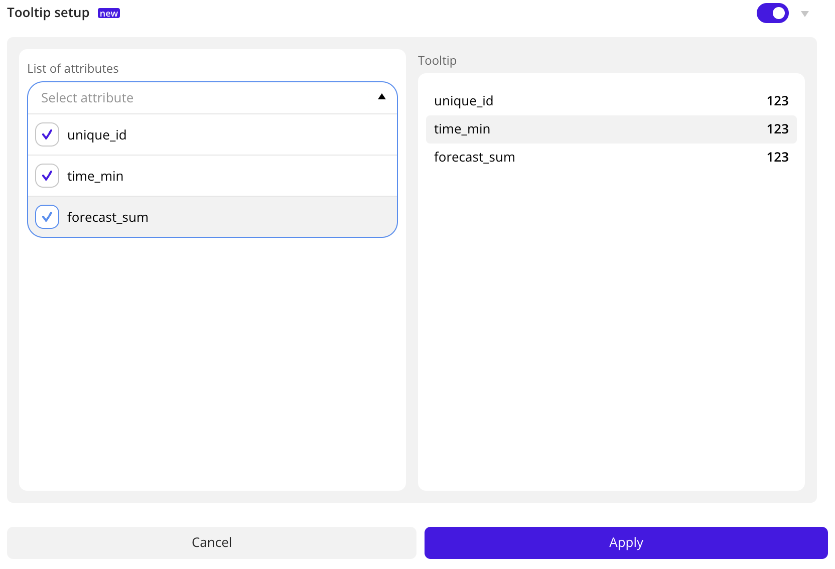
-
In the Tooltip field to the right of the attribute list, check how the tooltip will be displayed. Click Apply.
What's next?
- Getting started.
- Get to know how to work with Data.
- Learn more about Layers, Dashboards, Scenes, and Widgets.
- Learn about ready-made Analytics scenarios.