Overview
The documentation provides a description with examples of the interface in Russian.
Analytics scenarios are ready-made scenes with a set of layers based on built-in 2GIS data with customized visualization and widgets.
Possible scenarios
If you use the demo tariff plan, you can use the Competitors and demand and City infrastructure scenarios. Some data categories and datasets may not be available.
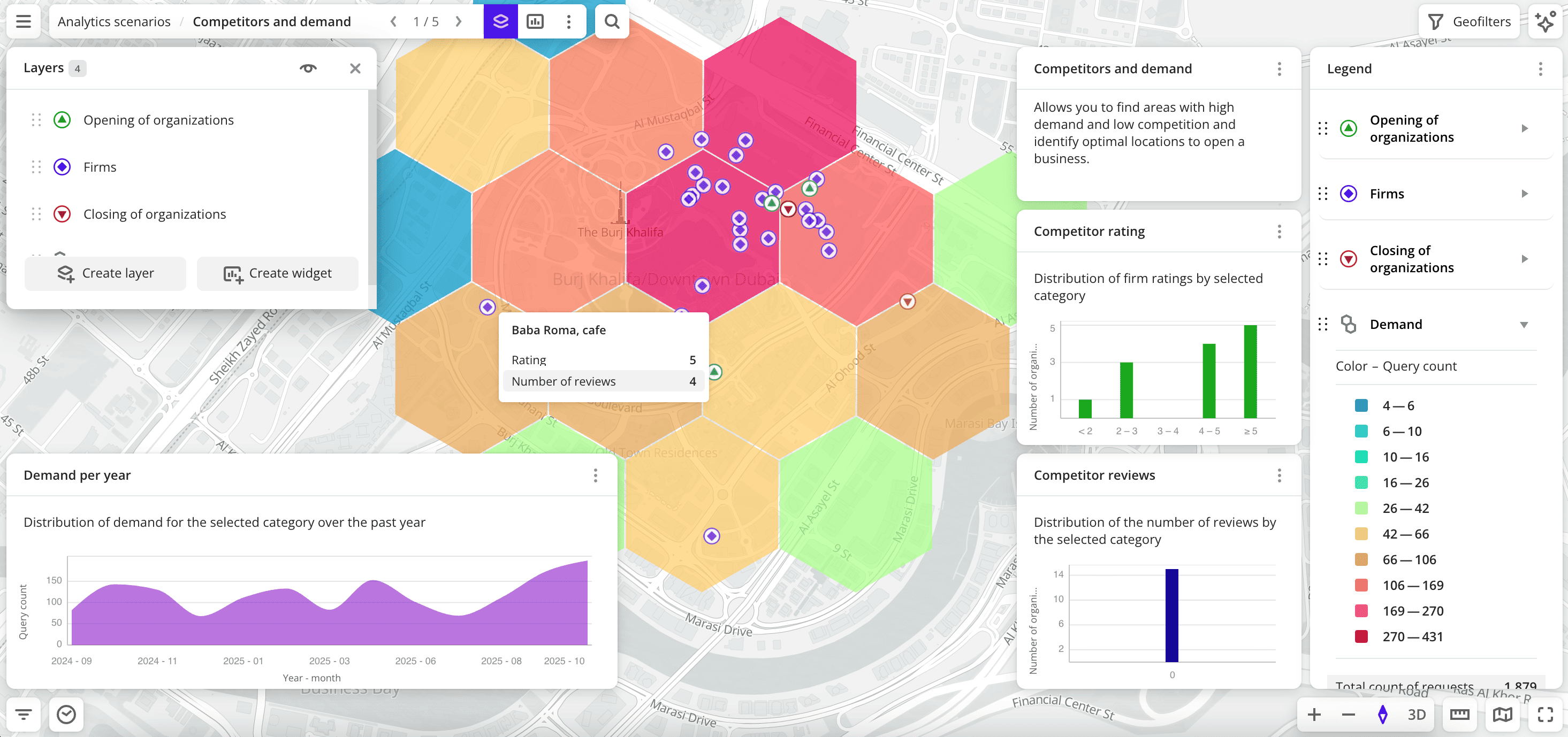
- Competitors and demand: allows you to find areas with high demand and low competition and identify optimal locations to open a business.
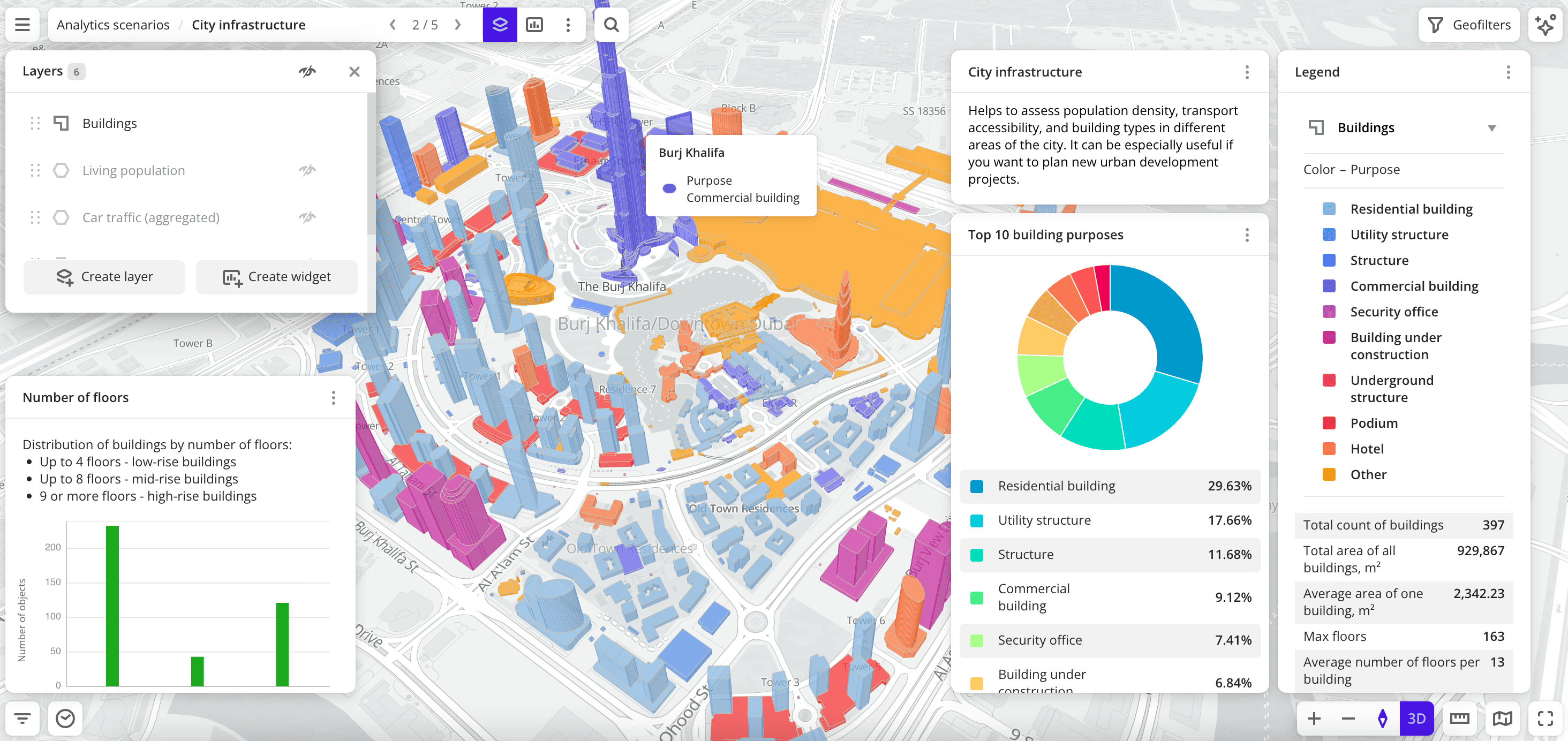
- City infrastructure: helps to analyze population density, transport accessibility, and building types in different city districts.
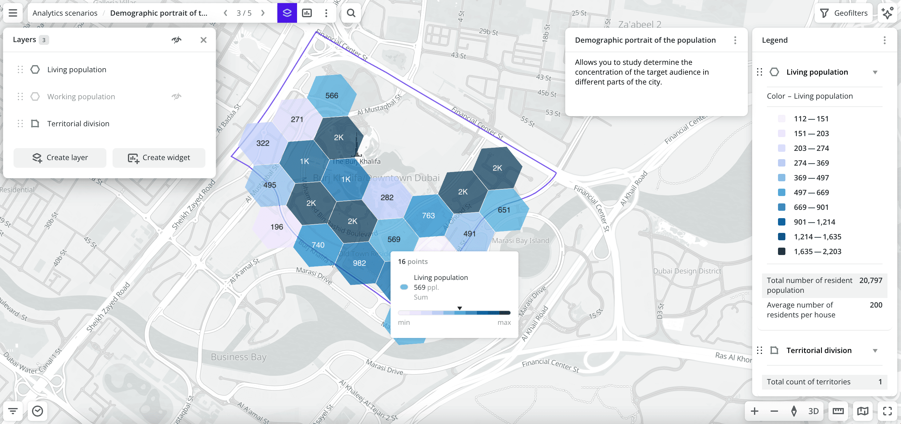
- Demographic portrait of the population: allows you to analyze the sex-age structure of the population and determine the concentration of the target audience in different parts of the city.
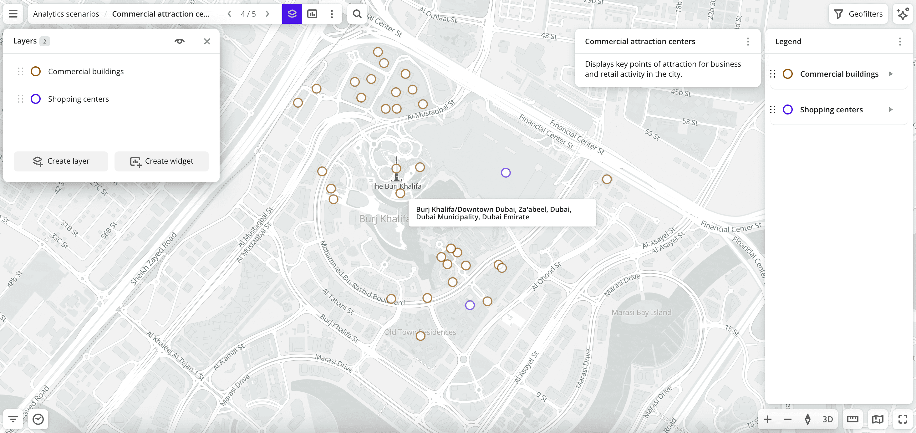
- Commercial attraction centers: displays key points of business and retail activity in the city.
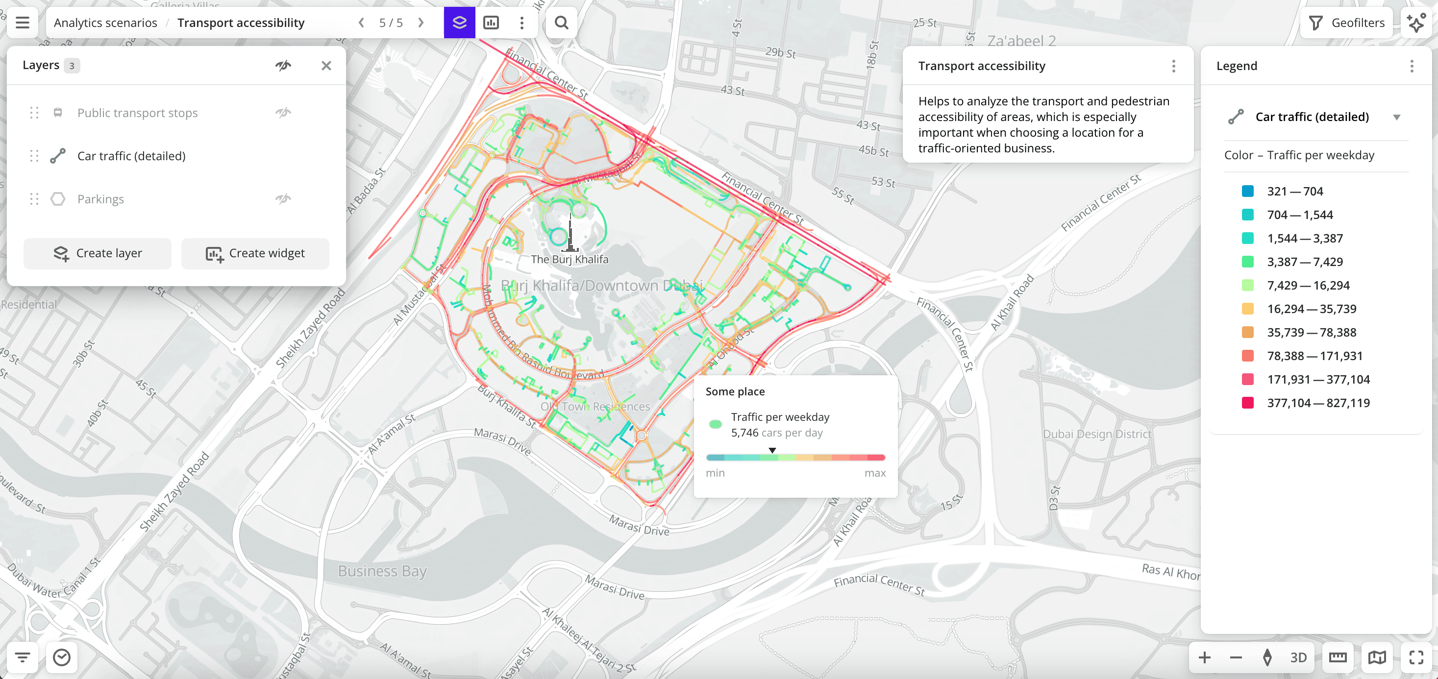
- Transport accessibility: helps to analyze the transport and pedestrian accessibility of territories.
You can analyze the potential of locations for small and medium-sized businesses using the interactive Location analytics dashboard without registering with the 2GIS Pro service.
Data in scenes
A scenario can be used only if you have access to all datasets used in it (except for the Competitors and demand and City infrastructure scenarios for the demo tariff plan). The created scenes will contain layers and widgets for the selected territories and data categories.
Competitors and demand
- Opening of organizations layer (not available in the demo tariff plan): sample from the Dynamics of organizations dataset. The visualization method is Point.
- Firms layer: sample from the Firms dataset by specified categories. The visualization method is Point.
- Closing of organizations layer (not available in the demo tariff plan): sample from the Dynamics of organizations dataset. The visualization method is Point.
- Demand layer: sample from the Demand dataset by specified categories. The visualization method is Hexbin.
- Competitor rating widget: column chart with competitor ratings from the 2GIS directory.
- Competitor reviews widget: histogram with the distribution of the number of reviews for competitors.
- Demand per year widget: area chart with the distribution of demand over the last 12 months.
City infrastructure
- Buildings layer: sample from the Buildings dataset (in the demo tariff plan, only non-residential buildings are available). The visualization method is Buildings.
- Living population layer (not available in the demo tariff plan): sample from the Buildings dataset. The visualization method is H3.
- Car traffic (aggregated) layer (not available in the demo tariff plan): sample from the Car traffic (aggregated) dataset. The visualization method is H3.
- Working population layer (not available in the demo tariff plan): sample from the Buildings dataset. The visualization method is H3.
- Public transport stops layer: sample from the Public transport stops dataset. The visualization method is Point.
- Parkings layer (not available in the demo tariff plan): sample from the Parkings dataset. The visualization method is Point.
- Top 10 building purposes widget: pie chart with distribution of buildings by purpose.
- Number of floors widget: column chart with distribution of buildings by number of floors.
Demographic portrait of the population
- Age-sex composition of the population layer: sample from the Age-sex composition of the population dataset. The visualization method is H3.
- Living population layer: sample from the Population dataset. The visualization method is H3.
- Working population layer: sample from the Population dataset. The visualization method is H3.
- Territorial division layer: sample from the Territorial division dataset. The visualization method is Polygon.
- Population distribution by sex widget: pie chart with the distribution of the population by sex.
- Population distribution by age widget: histogram with the distribution of the population by age groups.
Commercial attraction centers
- Commercial buildings layer: sample from the Buildings dataset filtered by building purpose (
Commercial building). The visualization method is Point. - Shopping centers layer: sample from the Buildings dataset filtered by building purpose (
Shopping center). The visualization method is Point.
Transport accessibility
- Public transport stops layer: sample from the Public transport stops dataset. The visualization method is Point.
- Pedestrian traffic layer: sample from the Pedestrian traffic dataset. The visualization method is Line.
- Car traffic (detailed) layer: sample from the Detailed car traffic dataset. The visualization method is Line.
- Parkings layer: sample from the Parkings dataset. The visualization method is H3.
Getting started
To create a scene for an analytics scenario:
-
Go to the Main tab.
-
In the Analytics scenarios block, select the scenario.
-
In the Geofilter settings dialog, select up to 50 territories for which the data sample is created. You can use standard and custom territories and also build polygons, proximity zones, and circles on the map. For more information, see the Geofilters section. After you select the territories, click Done.
-
If you selected the Competitors and demand scenario, select organization categories. You can select several categories and subcategories.
-
Click Continue.
-
Add the scene to the dashboard. If you do not have any dashboards created, a dashboard with one scene will be created. If at least one dashboard has been created, specify where to add the scene in the dialog:
- Select an existing dashboard from the list and click Add.
- To create a new dashboard and add a scene to it, click New dashboard, enter its name, and click Add.
After creating the scene, you can modify the data sample, customize visualization parameters for any layer, and create additional widgets.
What's next?
- Getting started.
- Get to know service features description.
- Get to know how to work with Data and Data visualization.
- Learn more about Layers, Dashboards, Scenes, and Widgets.