Visualization
Urbi Pro service provides several data visualization methods:
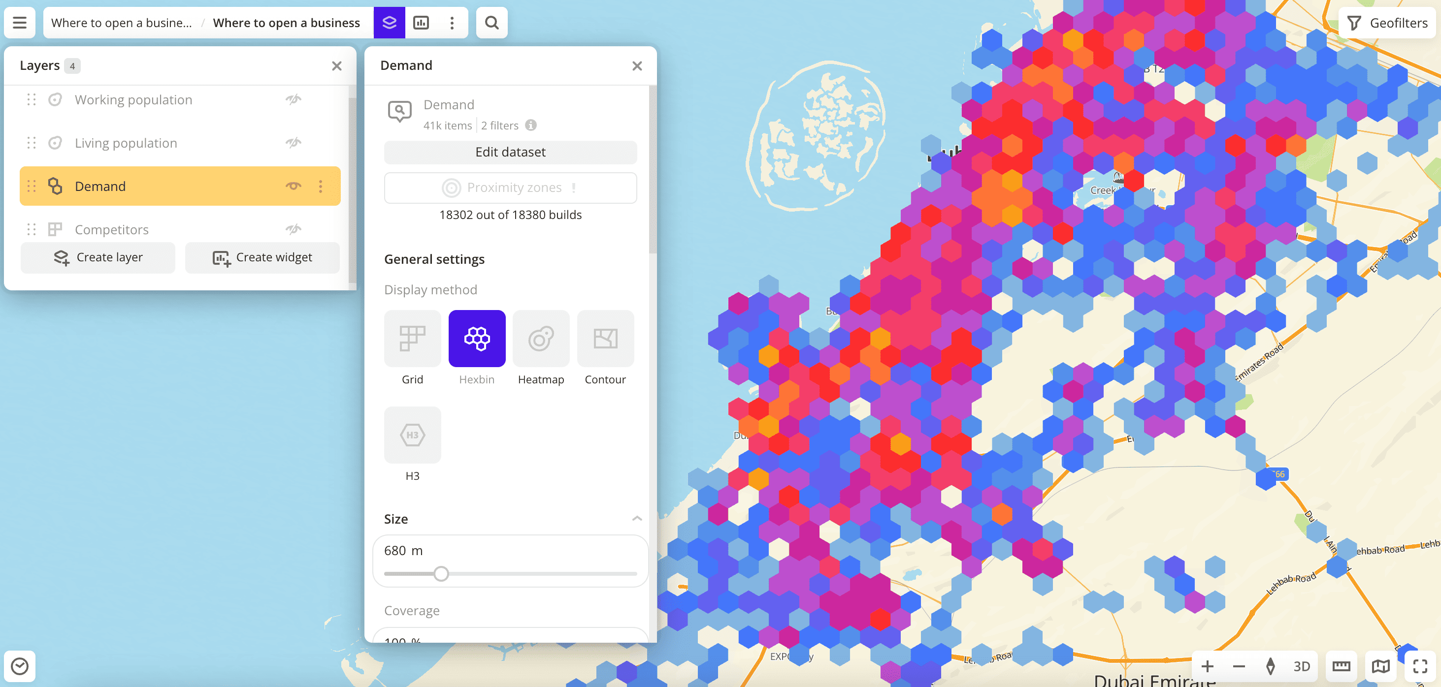
The visualization is customized for a specific layer, even if the layers are created from the same data sample. You can change the visualization of a layer at any time. Additional settings are available for each visualization method.
Getting started
- Go to the Dashboards tab.
- Open the required dashboard.
- To open the scene, use the arrows
 and
and  . If there is only one scene in a dashboard, it opens automatically when you open the dashboard.
 - To open the layer, click
 icon and select the required layer.
 - In General settings, select a visualization method.
- Set the remaining visualization parameters if necessary. See a list of parameters in the description of each visualization method, e.g., Point.
The data is visualized on the map.
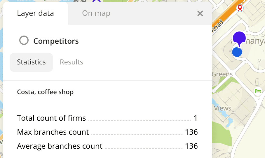
To get information about an item on the map:
-
Click the item on the map. Full information about the item is displayed in the new pane.
-
Hover the cursor over the item. A tooltip with a short help about the item appears.
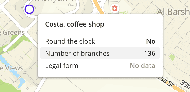
For layers with the Point, Buildings, Line, and Polygon visualization methods, you can specify a list of data attributes when configuring visualization parameters. The attributes are displayed in the tooltip. You can also configure a tooltip for a dataset to use the tooltip settings for all layers created from the dataset (only available for data uploaded as a file).
What's next?
- Quick start.
- Get to know how to work with Data.
- Get to know more about Layers, Dashboards, Scenes, and Widgets.
- Get to know prepared Analytics presets.