Creating a new widget
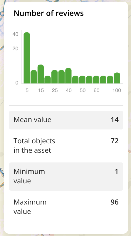
You can add widgets with different types of graphs based on data to the dashboards. For example, you can add a widget with a column chart and show a comparison of the data categories in the data sample on it.
Available types of widgets:
- bar chart
- column chart
- histogram
- line graph
- pie chart
Widget example:

Getting started

- Go to the Dashboards tab.
- Select the required dashboard.
- Click
icon.
- Click
icon next to the required layer and select Create widget.
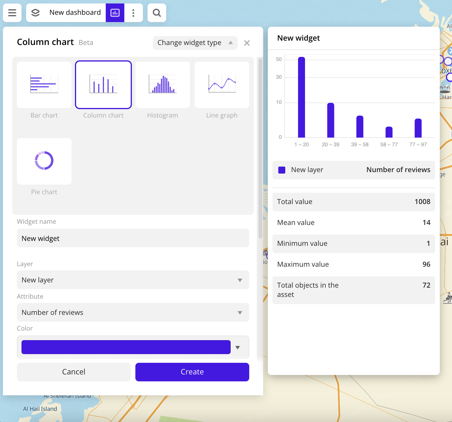
- Select a widget type.
- Set the widget parameters.
- Click Create.
Note
When using the uploaded data, at least one attribute must be specified in it to build a graph on the widget.
Parameters
-
Widget name: name of a new widget.
-
Layer: data layer that is used to build a graph on the widget.
-
Attribute: data attribute that is used to build a graph on the widget.
-
Different graph settings are available, depending on the type of a data attribute (text or numeric).
-
For text attributes:
- Color: selecting the color of the data display on the graph. For linear graphs, the color palette with the ability to specify any color in HEX format is available. For other graphs, selecting a color scale (a set of prepared color samples) is available.
- Number of values: number of attribute values that are displayed on the graph. The top 5 and top 10 values from the dataset are available.
- Show other: shows the sum of the last value and the remaining values below this position at the last position in the top.
- Show legend: shows the attribute values and the number of attribute data values.
- Values in percentage: shows the percentage distribution of attribute values.
-
For numeric attributes:
-
Color: selecting the color of the data display on the graph. For pie charts, selecting a color scale (a set of prepared color samples) is available. For other graphs, the color palette with the ability to specify any color in HEX format is available.
-
Type of data scale:
-
Number of ranges (except histograms): number of ranges with data that are displayed on the graph. The available number of ranges depends on the data, the maximum number is 10. Ranges are calculated automatically, but you can set them manually by entering the required range values. The specified upper limit is not included in the range.
To add a range, click
icon. To delete a range, click
icon. To recalculate ranges after configuration, click
.
-
Step size (for histograms): size of the interval of the data that is displayed on the graph.
-
-
Show legend: shows the data layer name and the attribute name that the graph is based on.
-
-
-
Appearance of the graph (except pie charts):
- Labels: labels of the attribute values on the graph.
- Axes: drawing axes on a graph.
- Grid: drawing a grid on a graph.
-
Additional settings: additional settings of data display on the widget. Available options depend on the type of data attribute.
- For text attributes:
- Show source: shows the data layer name and the attribute name that the graph is based on.
- Statistics: data aggregation in the data sample.
- Total objects in the asset: number of objects in the data sample, which are used to calculate the values.
- For numeric attributes:
- Show empty ranges (except pie charts): shows on the graph ranges of values without data.
- Show source (for pie charts): shows the data layer name and the attribute name that the graph is based on.
- Statistics: data aggregation in the data sample.
- Total value: total attribute value in the data sample.
- Mean value: average attribute value in the data sample.
- Minimum value: minimum attribute value in the data sample.
- Maximum value: maximum attribute value in the data sample.
- Total objects in the asset: number of objects in the data sample, which are used to calculate the values.
- For text attributes:
-
Change widget type: click to select another widget type from the list. The configured widget settings are saved.
What's next?
- See available Operations with widgets.
- Quick start.
- Get to know how to work with Data and Data visualization.
- Get to know more about Layers and Dashboards.
- Get to know prepared Analytics presets.