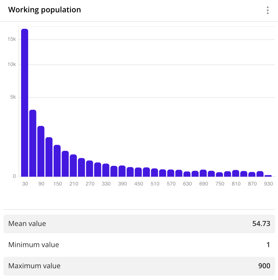
Histogram
A histogram displays as vertical bars how often a value occurs in specified ranges, and also displays the type of distribution of values. The higher the histogram bar is, the more values of the data attribute are included in the corresponding range.
Use a histogram to show the distribution of data by fixed ranges that are set using a step size.
Case example: show the distribution of working population:
Main features
-
The X-axis displays ranges of data values. As a grouping attribute, you can select:
- Numeric attributes: for example, number of reviews, building area, and others.
- Text attributes (for example, firm category, building purpose, and others) and attributes with the
Datetype for grouping data by time ranges. For these attribute types, a column chart with the number of objects in data groups is built instead of a histogram. You can build an extended column chart and select an aggregation attribute and function.
-
You can set a fixed range size (step size), such as 10, 20, 50, 100, or others. For example, to estimate the distribution of the average bill, use steps of 10 or 20 dollars. To estimate a distribution of age or the number of floors in buildings, use steps of 1 or 5. If you want to set up ranges of different sizes manually, use a bar or column chart.
-
By default, the histogram displays only the first 100 ranges. To see all the data, increase the range in the Step size field when creating a widget or editing it.
-
You can click the chart bars to filter data by the selected attribute without editing the data sample. For more information, see the Filtering through widgets section.
-
If the filtering by territories or data attributes is applied on a dashboard scene, only the values that match the filters are displayed in the widget. For more information, see the Filtering data on a scene instruction.
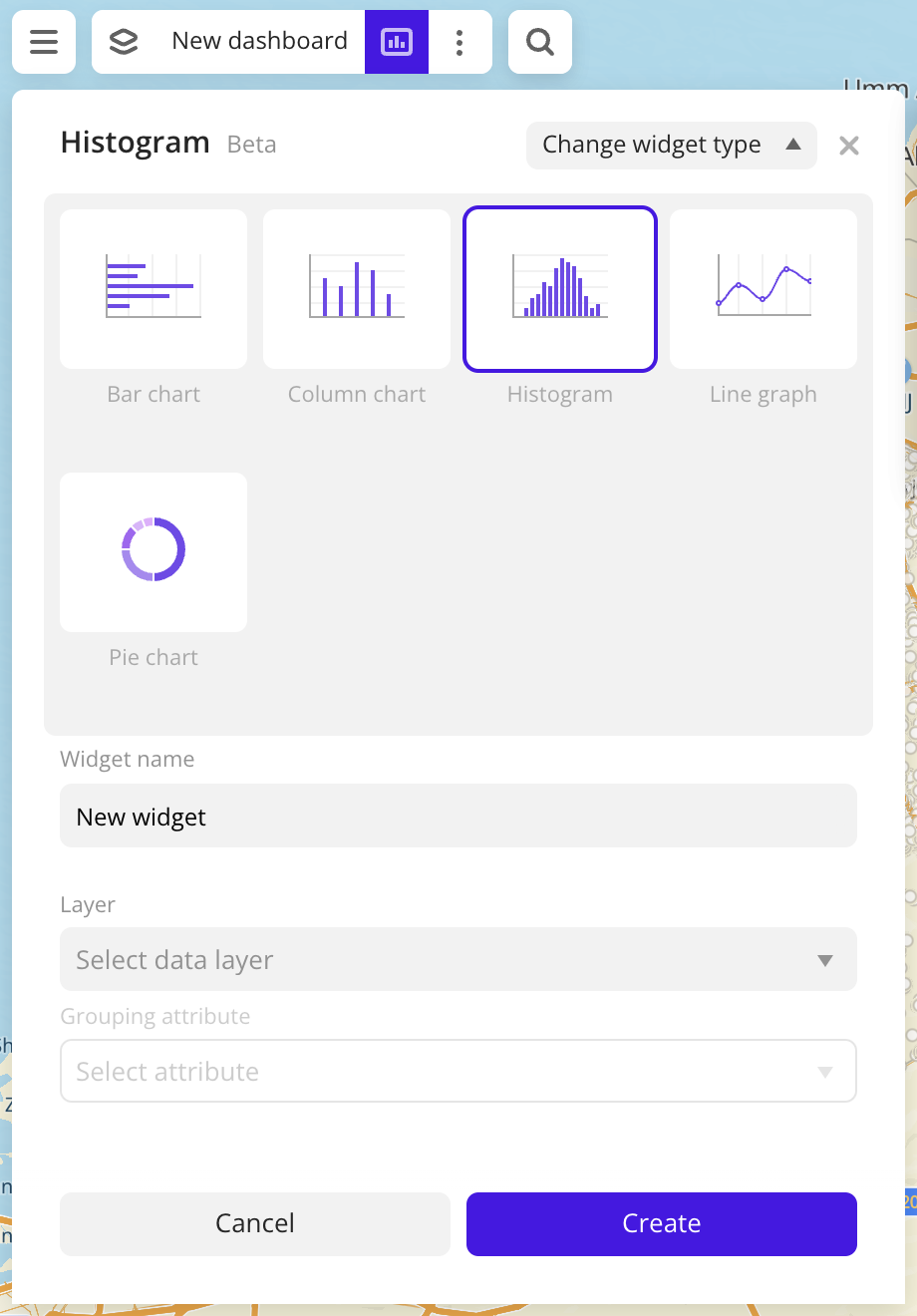
Creating a widget
-
Go to the Dashboards tab.
-
Open the dashboard.
-
Open a scene using the arrows
 and
and  . If there is only one scene in the dashboard, it opens automatically.
 -
In the top menu of the dashboard, click
 icon.
icon. -
Select the Histogram widget type.
-
Specify the required parameters:
- Layer: data layer used to build a chart in the widget. If you work with the uploaded data, make sure it contains at least one attribute.
- Grouping attribute: attribute used to group data.
- Step size: fixed size of data ranges.
-
Set the remaining widget parameters if necessary.
-
Click Create.
The new widget is automatically added to the selected dashboard scene.
Parameters
General widget settings
Parameter | Description |
|---|---|
| Widget name | Widget name. |
| Layer | Data layer used to build a chart in the widget. |
| Change widget type | Click to select another widget type from the list. The configured widget parameters are saved. |
X and Y axes
Parameter | Description |
|---|---|
| Grouping attribute | Attribute used to group data on the chart. Attribute values are displayed on the X-axis. Available settings depend on the attribute type: text, numeric, or Date. |
| Step size (for numeric attributes) | Fixed size of data ranges. |
| Grouping attribute value (for text attributes) | Vertical bars on the chart. As values, you can select the following:
For text grouping attributes, you can use a column chart instead of histogram. |
| Period settings (for attributes with the Date type) | Vertical bars on the chart. As values, you can select the following:
For attributes with the Date type, you can use a column chart instead of histogram. |
| Formatting | Format of the attribute value displayed in the tooltip when hovering over a column on the chart and in the widget legend. Available formats:
|
Description
Parameter | Description |
|---|---|
| Text | Text displayed in the widget above the chart. The maximum number of characters is 5000. |
| H1 | Title (heading 1). |
| H2 | Heading 2. |
| H3 | Heading 3. |
| B | Bold. |
| I | Italic. |
| U | Underline. |
 | Inserting a link. |
| Color | Text color. Select a color from the palette or specify it in the HEX format. |
Appearance of the graph
Parameter | Description |
|---|---|
| Color | Color settings of bars on the chart that depend on the attribute type:
|
| Show axis titles | Shows the labels of the X and the Y axes on the chart. By default, names of the selected attribute values are shown. To change the axes labels, enter new values in the X-axis and the Y-axis fields. The maximum number of characters is 50. |
| Labels | Shows the attribute values on the X and the Y axes. |
| Axes | Shows the axes on the chart. |
| Grid | Shows a grid on the chart. |
 icon. The color is also reset when the grouping attribute is changed. Example:
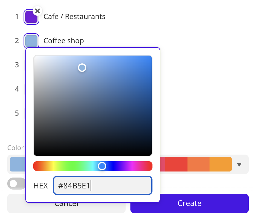
Additional settings
Parameter | Description |
|---|---|
| Type of scale | Distribution type used to calculate data ranges on the chart:
|
| Show legend | Shows the values of the grouping attribute and the corresponding count of objects in the group. For text grouping attributes only (for this attribute type you can use a column chart instead of histogram). |
| Values in percentage | Shows the count of objects in the group as a percentage. Displayed in the legend (for text grouping attributes and attributes with the Date type only - for these attribute types you can use a column chart instead of histogram) and in the tooltip when hovering over a column on the chart. |
| Show source | Shows the name of the data layer, the grouping attribute and the aggregation attribute with the corresponding axes, and also the aggregation type. |
| Show empty ranges | Shows on the chart the ranges of values without data. For numeric grouping attributes only. |
| Total objects in the asset | Shows the number of objects in the sample used to calculate the values. |
What's next?
- Get to know more about other Widgets types.
- See available Operations with widgets.
- Getting started.
- Get to know how to work with Data and Data visualization.
- Learn more about Layers, Dashboards, and Scenes.
- Learn about ready-made Analytics scenarios.