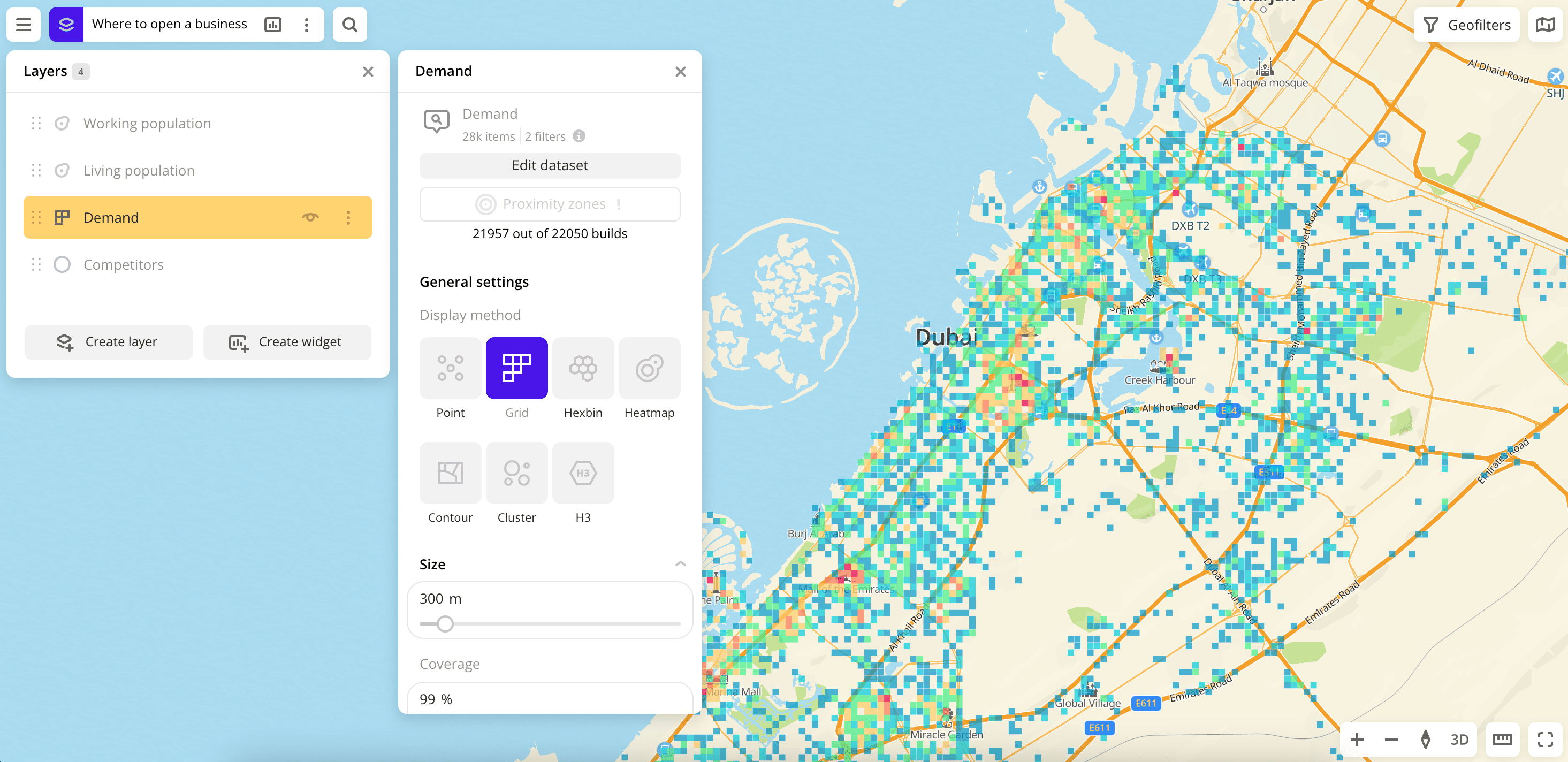
Grid
The Grid visualization method is useful when you need to estimate the area and identify the difference between elements. The territory is divided into equal sections, which is displayed taking into account the value of the selected parameters.
The data is aggregated and equally distributed over the entire area within the boundaries of the element. You need to pay attention to the minimum and maximum indicators.
The Grid in many ways is similar to the Hexbin visualization method. The shapes are created automatically, and the algorithms inside them work the same way. These methods are convenient to use together when you need to see two layers of aggregated data.
Overview
To choose a visualization method:
- Go to the Dashboards tab.
- Open the required dashboard.
- To open the scene, use the arrows
 and
and  . If there is only one scene in a dashboard, it opens automatically when you open the dashboard.
 - To open the layer, click
 icon and select the required layer.
 - In General settings, select the Grid visualization method.
- Set the remaining visualization parameters if necessary.
The data is visualized on the map.
Parameters
For the Grid visualization method, the following parameters are available:
-
Size: size of the element from
5to3000in meters. -
Coverage: coverage of the territory from
1to100in percentage. Only the distance between the elements changes. -
Caption: turning on the caption on grid elements.
-
Color: selecting the color of the data display.
- Color basis: parameter based on which the elements on the map are colored according to the Color scale (a set of prepared color samples). The available values depend on the data in the sample. You can select only numeric attributes.
- Invert: select to invert the selected color scale.
- Steps: gradation of the color scale from
1to10. - Legend: symbols for color and data.
- Color aggregation type: color aggregation method (
SumorMean). - Type of scale:
Linear— displays values of the same order;Logarithmic— displays a wide range of values, when the values may differ by several orders of magnitude. - Opacity: setting an opacity of the elements on the map.
-
Height: enable to display the data as a column chart. To enable three-dimensional display format on the map, select the 3D in the bottom-right corner of the map.
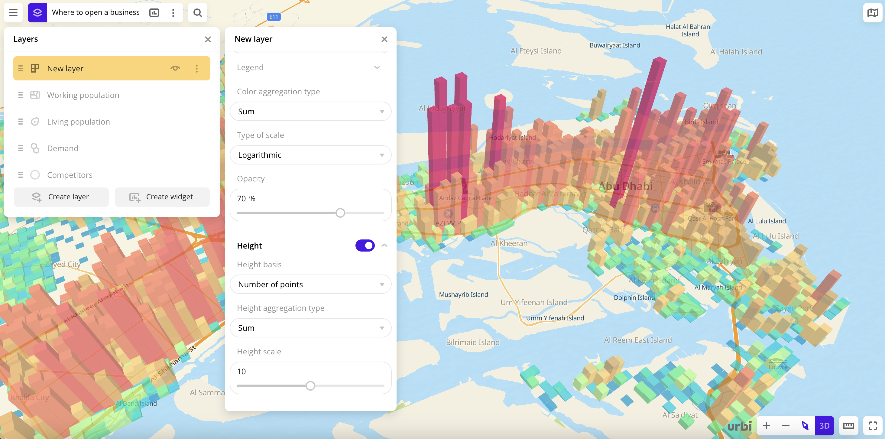
- Height basis: parameter based on which the elements on the map are formed. The available values depend on the data in the sample. You can select only numeric attributes.
- Height aggregation type: height aggregation method (
SumorMean). - Height scale: column height multiplier from
0.1to20.
What's next?
- Quick start.
- Get to know how to work with Data.
- Get to know more about Layers, Dashboards, Scenes, and Widgets.
- Get to know more about other Data visualization methods.
- Get to know prepared Analytics presets.